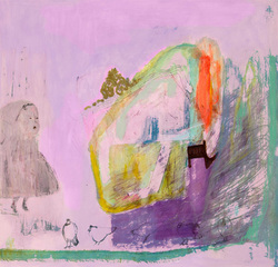
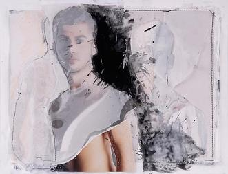
Anna Gonzalez on Etsy
It's not that hard to call yourself an artist - the word has become almost meaningless. Being an artist, however, is still not easy, and making a living as one is as tricky as it's ever been - maybe more so. Galleries are invaluable - as in Philadelphia's Old City area, good galleries and dealers can center the energy of a lively, thriving arts scene and provide vital community spaces. It can be tough, though, for an artist to find the right one or to find one at all. But thanks to the technology we all love/hate, there are lots of opportunities for artists - and for viewers and collectors - that didn't exist before.
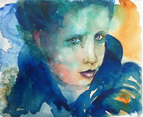
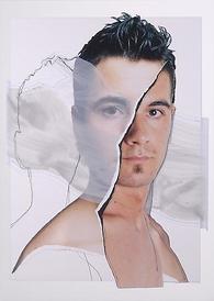
Marilyn MacGregor on Etsy
So this blog post is dedicated to working artists who engage with the promise and potential of online galleries as the newest way to get their work noticed and, with luck, sold. A disclaimer: I'm on that list. I'm a believer in social media as a living community, and in the opportunities made available by online art spaces - my participation is a vote for these avenues as a good thing for human and arts interactions.
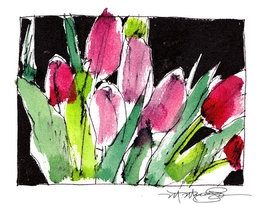
Sally Mara on Etsy
You probably know the biggest of these sites - Etsy. Etsy, which got started in 2005 (it has a Wikipedia page, surely a mark of success!) is well-known as the go-to site for charmingly hand-crafted home decor, clothing, kid's stuff and objets in general. It also allows vintage sellers and craft suppliers. What you may not know is that there are a lot of very good artists on Etsy, often successful illustrators or gallery artists who like having a way to sell lower cost prints or even originals direct from their studios.
Fine Art America is another big site, one that is more focused on 'fine art.' There's a lot of very amateur and questionable work to sort through, unfortunately, but it's worthwhile taking a careful look - you can find truly 'fine' artists on FAA offering their work as low priced prints and cards. Behance is another quality online portfolio site, this time geared towards illustrators and graphic artists - some really amazing things. Some of the work is for sale, or you can find links to where you can purchase prints. Major illustrators and designers show their work on Behance - as with all these sites, you can show your appreciation for impressive skill and imagination with a comment or a click on a button.
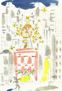
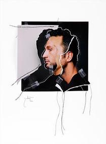
 P Maure Bausch on FAA | 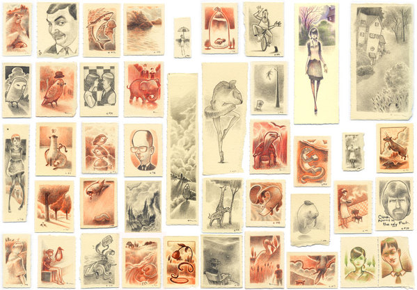 Eric Hancock on Behance |
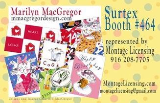
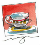
My card for the Surtex Show in May in NY
Recently I've been working with agent Kimberly Montgomery of Montage Licensing on designs and illustration work for the Art Licensing field, including paper, textile, and other uses. In the course of learning more about this field I've discovered another fun site where you can find original art, this time in the form of fabric designs. The site is called Spoonflower - you'll have a great time browsing through an abundance of original designs by real artists. You can purchase these unique fabrics for a single pillow or a complete overhaul of your upholstery!
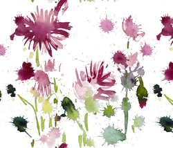
Cestlaviv - Vivian Ducas on Spoonflower
Most artists by nature are multi-taskers. These sites are a few of the ways that they can show their work in more than one dimension and for multiple purposes. It's a huge opportunity for buyers too. It may take a little patience to sort through and find favorites, but life is like that - and it can be fun and very rewarding. You'll be looking at art and artists from all over the world. (Anna Gonzalez - at the top of the page - lives in the Canary Islands) I've included some examples from each of these sites, chosen almost at random in a search for high quality and my own taste, with links to the work on the sites (click on the images). I've also included my links - please click on them to take a look and leave me a comment or a click!
http://www.etsy.com/shop/MacGregorArt
http://fineartamerica.com/profiles/marilyn-macgregor.html
http://www.marilynmacgregor.com/
http://www.behance.net/marilynmacgregor/frame
http://www.etsy.com/shop/MacGregorArt
http://fineartamerica.com/profiles/marilyn-macgregor.html
http://www.marilynmacgregor.com/
http://www.behance.net/marilynmacgregor/frame


 RSS Feed