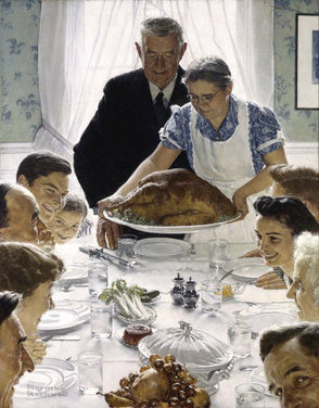
Norman Rockwell - Freedom from Want 1943
Norman Rockwell did not invent Thanksgiving. It may seem like it: if you've ever seen his iconic illustrations for the holiday, you know what Thanksgiving is supposed to be like. There they are (nobody I know but they must be out there) clean, scrubbed, and hungry, ready to dig into the enormous (authentic farm-raised) bird cooked by the loving grandmother, who brings it to the table, her (spotless) apron still in place, to place before the patriarch in his best (well-worn but neatly mended) suit so that he can offer a (modest but sincere) blessing.
It's easy, in our ironic, less modest and sincere age, to poke fun at this and other of Rockwell's images, to criticize - where are the people of color?, where are the vegetarian alternatives? - but Rockwell's Thanksgiving images, like much art, must be judged in context to appreciate. It's just as easy to miss the sly bits - the guy in the right corner peeking up at the viewer, breaking the illusion to ask, 'What do you think? Do you believe this?'
It's easy, in our ironic, less modest and sincere age, to poke fun at this and other of Rockwell's images, to criticize - where are the people of color?, where are the vegetarian alternatives? - but Rockwell's Thanksgiving images, like much art, must be judged in context to appreciate. It's just as easy to miss the sly bits - the guy in the right corner peeking up at the viewer, breaking the illusion to ask, 'What do you think? Do you believe this?'
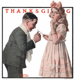
Norman Rockwell 1921 (The Country Gentleman)
An illustrator would not want to paint like that now, nor would there be a client for it - but Rockwell was a master and there is much to admire. Look at the way he places arms and legs, how he uses white or negative space, the subtle play of gesture and angle. Ironically, however, his most famous 'Thanksgiving' image is, well, a bit ironic. It doesn't represent Thanksgiving - the title is Freedom from Want. This was the cover of the March 6, 1943 Saturday Evening Post, one of Rockwell's celebrated Four Freedom covers, created in the midst of a grueling war to remind America of it's good fortune. (The others are Freedom of Speech, Freedom of Worship, and Freedom from Fear) Some of those freedoms feel under fire these days, with the troubling news of economic and physical battering for too many Americans right now. It is a different time, and art always wears the cloak of its own time and place.
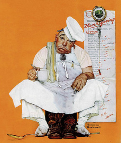
Norman Rockwell - Thanksgiving Day 1942 (Saturday Evening Post)
Rockwell did do other actual Thanksgiving illustrations, less sober and moralistic. He was a wonderful storyteller in the wholesome American folktale sort of mode, with a rollicking sense of visual humor that matched perfectly to the unironic, self-congratulatory mid 20th century, before hippies, rebels, and civil rights protesters started peeling back the veneer to reveal so much that needed to be admitted and addressed.
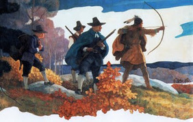
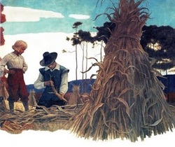
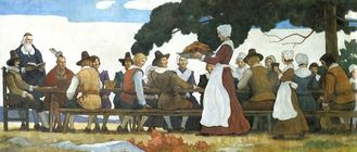
N.C. Wyeth - Pilgrim Mural 1940's
Rockwell follows in the footsteps of America's greatest illustrator, N. C. Wyeth, who is best known for his powerful Treasure Island series. He also did what could be classified as Thanksgiving illustrations; in 1940 he began a series of murals about the Pilgrims for the Metropolitan Life building in New York.
N.C. Wyeth - Pilgrim Mural 1940's
His take on this American tradition is colorful but somber, with careful attention to historical detail - gravitas fit to a darker time. You can find some of the Pilgrim illustrations gathered into a beautiful picture book, N. C. Wyeth's Pilgrims, by Robert San Souci, himself a prize-winning illustrator. An illustrator has to be a good storyteller - what sets both Wyeth and Rockwell at the top is their handling of story, color, form, detail - everything adding up to so much more than the whole.
NC Wyeth - Pilgrim Mural 1940's
Happy Thanksgiving! What does your Thanksgiving look like?
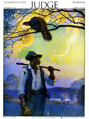
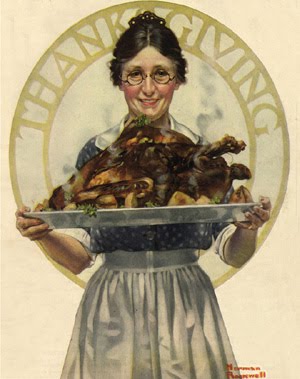
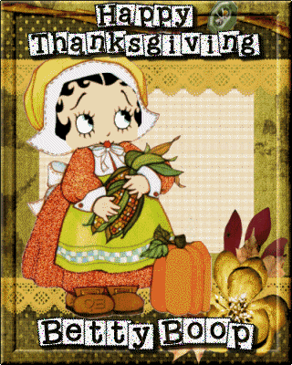
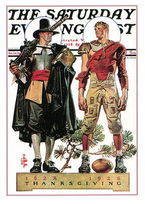
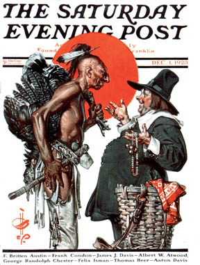
Here is a range of images of Thanksgiving images from the sublime to Betty Boop!
Here is a range of images of Thanksgiving images from the sublime to Betty Boop!


 RSS Feed