Hip hip and cheerio to the Queen and all that - you may think that England is the last bastion of conservative tradition, but not when it comes to the Arts. The US caved long ago to conservative interests in terms of major public funding and awards, but the Turner Prize, awarded each year to a British artist under 50, reminds us that energy, spirit and imagination should be celebrated, even if you don't like it or agree with it. In 2003 the Turner Prize was awarded to Grayson Perry, described by Wikipedia as 'an English artist, known mainly for his ceramic vases and cross-dressing.'
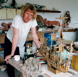
I recently heard Grayson Perry on a BBC podcast about traditions and was so struck by his interesting remarks that I had to find out more about him - and discovered a whole new world. I can't believe I've missed him until now - he's no shrinking violet. A new member of the Royal Academy, he currently has a big show at the British Museum called The Tomb of the Unknown Craftsman. Part of his contribution to the Traditions discussion was a comment about liking to work with mediums that require skill and relate to age-old processes, not only ceramics but lately also tapestry.
Quotations from the Internet 2005
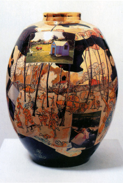
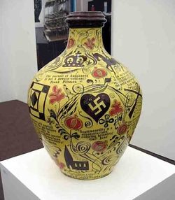
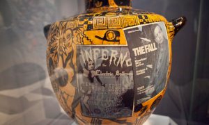
In his ceramics he sticks with traditional forms such as standing vases reminiscent of Greek amphora; he claims to like lulling people into a feeling of security with forms they think they recognize and with expectations of reassuring patterns - flowers or a simple landscape - and then hitting them over the head with his intricately drawn decorations full of wit, puns, historical references and social comment.

He says he has little use for the post-Duchamp conceptual idea of art - it's art if I say it's art - so goes out of his way to make his life as well as his art an exercise in complicated, elaborate craftsmanship. And he's having a great deal of fun doing it - he seems a bit like Cindy Sherman with a sense of humor. And there's his 50-year old teddy bear, Alan Measles, who is something of a god in his world.
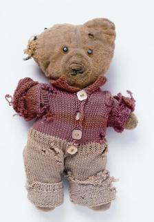
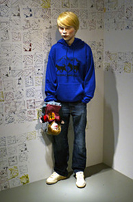
Alan Measles
| 
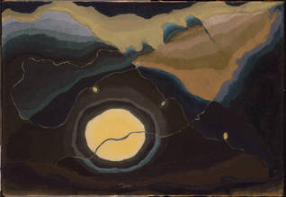
Grumpy Old God 2007
|
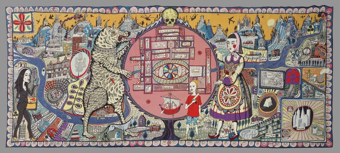
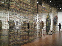
Map of Truths and Belief 2011 (tapestry)
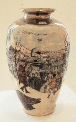
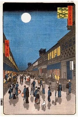
Punters in the Snow 1999
I've always on the lookout for great use of drawing and here's a wonderful example of a good hand, plus mind and heart working together to create a sum much greater than the parts. An instant favorite for me is his Punters in the Snow - a witty homage to Bruegel's elegiac 16th century painting Hunters in the Snow. Grayson Perry, his work and life, brought to mind Shakespeare's line from The Tempest: O brave new world That has such people in't!
I found visuals and interesting information and about Grayson Perry on several blogs including these:
http://thissydneylife.wordpress.com/tag/grayson-perry/
http://thecourseofempire.blogspot.com/2012/04/grayson-perry.html
http://normsonline.wordpress.com/2012/01/06/grayson-perry-tomb-of-the-unknown-craftsman/
and a longer article on the Royal Academy website
http://www.royalacademy.org.uk/ra-magazine/autumn-2011/fantasy-factory,298,RAMA.html


 RSS Feed