What do you think?
http://www.dia.org/
Wikipedia gives a good account of the history and holdings of the DIA
http://en.wikipedia.org/wiki/Detroit_Institute_of_Arts
All art in this post is from the collection of the Detroit Institute of Arts
artsmarttalk.com |
|
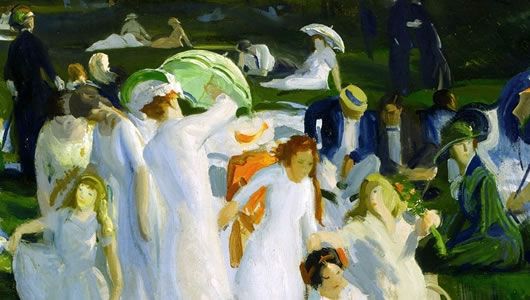
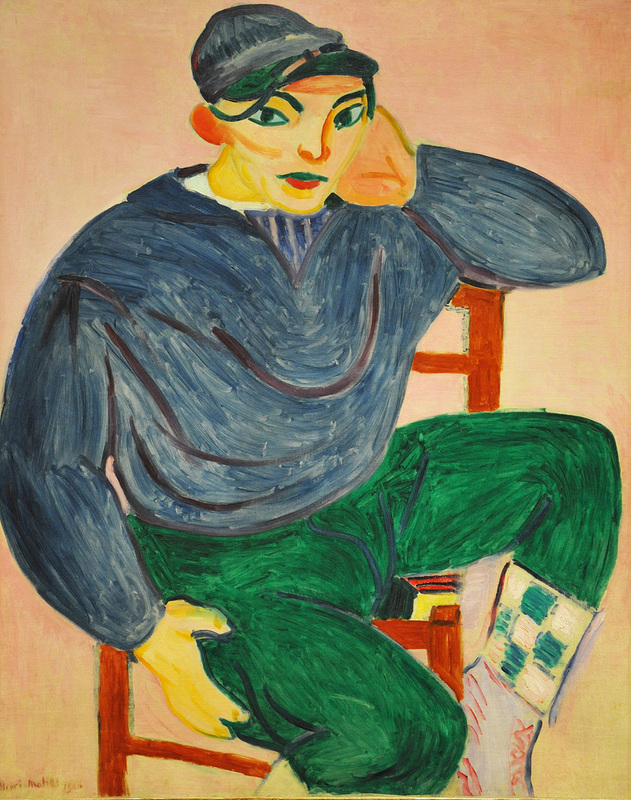
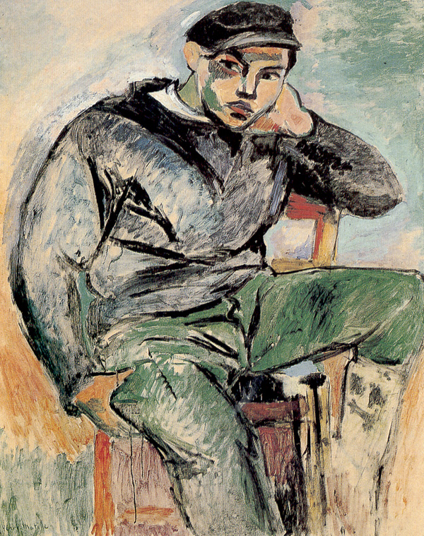
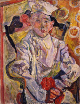
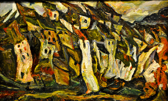
George Bellows A Day in June 1913
In the young adult novel The Giver the world is a fair and equal place, a peacefully drab community of such numbing sameness that random chance, even if sometimes cruel and unjust, gradually comes into focus as a valuable part of human existence. The first insidious hint for the reader that the gleaming utopia is in fact a horrifying dystopia is the dawning awareness that the world in The Giver has no color. No color, thus no racism - no color, thus no flashy show-off fashion - no color, thus few ways to tout superiority through superficial indicators. But just think... no Color. No rainbows, no bright spring flowers, no blue sky, no rich range of greens, blues, yellows, oranges found in food, fabrics, cars, cats, trees, houses, etc., etc. Need I mention that there is no art in this sad practical world? Culture as a category has been expunged as messy and troublesome. 
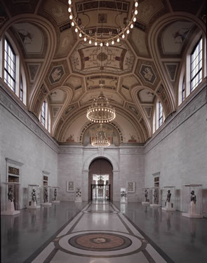
Great Hall Detroit Institute of the Arts This post is dedicated to the Detroit Institute of Arts, one of the greatest of American museums, with an international collection of art that ranks among the best in the world. No surprise there; the font of American industrial wealth centered in Detroit was perfectly sited to nurture the DIA in the late 19th and early 20th century when the great American museum collections were being compiled. A long list of European masterpieces is a given, but the DIA is a vibrant, living place with a vigorous embrace of world art and contemporary art as well. The setting is also first rank, a landmark building designed by Paul Cret, the French-born, Philadelphia-based master architect. 
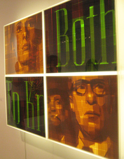
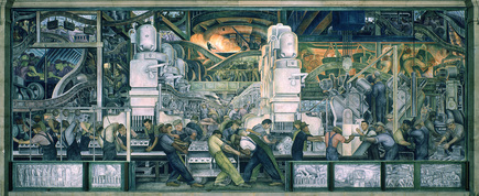
Diego Rivera Detroit Industry Fresco Cycle (detail) 1932-33 And now, when Detroit has been left out to dry for a sad laundry list of reasons and inevitabilities, this great institution has become a pawn. None of the art has been sold off yet but the possibility seems to be very real. If that happens, what will be lost? Will it be the complete set of massive murals by Diego Rivera, commissioned in 1932 by Edsel Ford as homage to Detroit’s world-changing invention and hard work? 
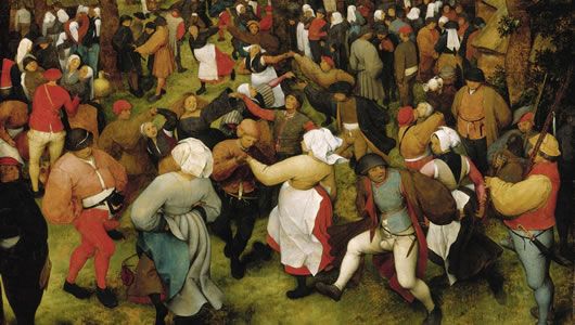
Pieter Bruegel The Wedding Dance 1566 Or one of the priceless (but a price will be established, never worry) Van Goghs, his Self Portrait with Straw Hat (the first of his self-portraits to enter an American museum collection) or his portrait of Postmaster Roulin, partner to the masterpiece at the Barnes Foundation? How about the fabulous Bruegel Wedding Dance from 1566, one of only a handful by this master in the U.S.? Would it matter, after all, if this great collection were to be nibbled away at the edges, like a prized cashmere blanket left to the mercy of moths? 
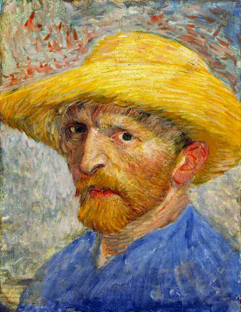
Van Gogh Self Portrait with Straw Hat 1887 Yes. It matters very much. Art is the color in our banal and practical world; without it we lack grace, joy, and rich significance, we miss the palette of magnificence that offsets and complements the hum and strain of daily life. While a collection like Detroit’s might have been built by grim, hardworking men who made their fortunes by the grinding screech of machines, the benefit of the art they amassed is that it calls us all - then, now, and far into the future, to eternal grandeur. Donald Sultan Oranges on a Branch March 14 1992 Great art is what reminds of us of our possibilities, no matter how often and by how much we fall short in the effort. The glory of art, the stuff of human striving towards the divine in some form, is there to pick us back up, dust us off, and inspire us to try again. The DIA and its irreplaceable collection is a trust for the long haul; at this moment, as much if not more than any other, we must remember that it is not ours to bargain with. Great museums hold our collective memory; they must be maintained and respected for those who come after us. Once we start chipping away pieces we cannot guarantee the integrity of the whole; the story of humankind starts losing pages. 
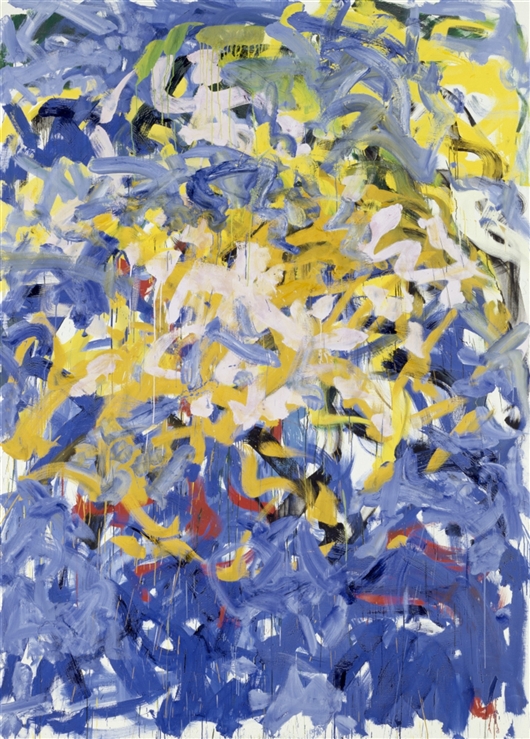
Joan Mitchell Before After ii 1998 Human lives and accomplishments function on a strange sliding scale in our world; those with fancy cars and fat bank accounts get high marks and great esteem, never mind the possible human cost of all that luxury, while pitiful souls who scrape by in creative fields are often denigrated as losers and ne’er do wells. When Detroit was alive with industrial wealth it was a byword of the American Dream, but now that the party has moved on, the glory days are forgotten and the city and the people who worked to achieve that wealth get kicked to the curb. 
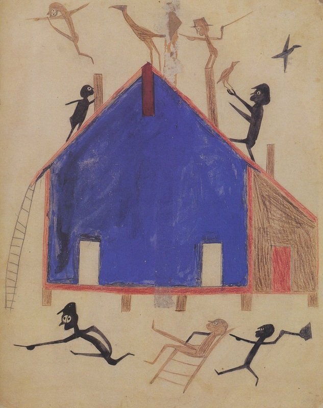
Allie McGhee Night Ritual 1991 Apparently artists are now moving into Detroit, attracted by the dirt-cheap housing and the freedom from the high overhead of thriving cities like New York. How ironic that an artist like Van Gogh, who starved and suffered through his sad existence while sharing his explosive joy in life in paintings that no one wanted during his lifetime, might have been one of them. How weird that he is now considered a commodity with enough ka-ching to make a dent in the plight of a down-on-its-luck American city. What do you think? The Website of the Detroit Institute of Arts
http://www.dia.org/ Wikipedia gives a good account of the history and holdings of the DIA http://en.wikipedia.org/wiki/Detroit_Institute_of_Arts All art in this post is from the collection of the Detroit Institute of Arts
5 Comments
Blue House with People Bill Traylor I’ve been mulling over the term ‘Outsider Art’ since I saw ‘Great and Mighty Things: Outsider Art from the Jill and Sheldon Bonovitz Collection, at the Philadelphia Museum of Art’ a couple of weeks ago. Outsider Art is an accepted term in current artspeak, but there is something intrinsically troubling about it. It’s not that the label is politically incorrect or insensitive – although it is – but that it purports to sit in judgment on the art, not merely on the people who make it. In fact, if ‘Outsider Art’ were altered slightly to ‘Outsiders’ Art’ I’d have less of a problem with it. 3 VW vans Martin Ramirez At face value ‘Outsider Art’ means art made by people outside the accepted world of art - no training, no galleries, no knowledge of the art world - simple folk making art free of ‘civilizing’ constraints. Outsider art is free of the knowing, educated intellect that adds a sophisticated gloss to ‘Insider Art.’ It is also, one needs to add, free of the cynical, ironic, arch bullshit that is all too often given pride of place in contemporary ‘Real Art.’ Man, Fish, Rooster David Butler Outsider Art is the least cynical of art - it isn’t looking for a spread in a magazine or a grant or the approbation of fussy critics. Whether it’s good or not Outsider Art leads with the heart rather than the mind, celebrates the hand/heart connection, traffics in physical, sensual objects, and doesn’t care a whit what you think. It is the ultimate anti-Conceptual Art, the ‘who the heck is Marcel Duchamp?’ art.* Assemblage/Painted Frame Simon Sparrow Raw Vision, a publication devoted to Outsider Art, relates the history of the term. Beginning in the mid-19th c. and especially with the development of psychology, came the awareness of another kind of art - art by psychiatric patients, often done on random bits and pieces of paper, described as being ‘of unusual quality and power.’ French artists Jean DuBuffet and André Breton picked up on the importance of these untamed visions in the 1940’s and gave the work the name ‘Art Bru’ - Raw Art. The term Outsider Art was coined by a British critic in 1972, an unfortunate shift in meaning away from the power of the work to the diminished status of those who create it. from Story of the Vivien Girls Henry Darger Henry Darger, whose vast body of work was brought to light after his death in 1973, is one of the most emblematic of ‘Outsider Artists.’ His profile fits - childhood deprivations, time in institutions, lack of a secure place in the world – and his work is singular, visionary, obsessive/compulsive, with a haunting, compelling power and beauty. The show of his work at the Museum of Folk Art in New York (in their beautiful contemporary building, now under demolition threat from that neighboring haven of ‘Insider Art’ – MOMA) wowed the world and did much to put ‘Outsider Art’ on the official map. Darger poured his heart and his whole life into his limitless narrative full of drawings of beleaguered children in a hostile world, and now his obsessions inform other art forms, especially graphic novels and contemporary music. Interior James Castle Darger is not included in the PMA show but many of the artists in the show are important ‘Outsider’ names. James Castle, one of the most interesting for me, lived his life in profound silence because of deafness; it is not known how well, or even if, he could read or write. Using sharpened sticks, soot, and saliva applied to discarded cardboard and food containers, he created elegant, often highly refined scenes of interiors and landscapes. His knowledge of perspective, assumedly instinctive rather than learned, is impressive and the drawings show a masterful, confident hand. He also made collage/assemblage constructions with cardboard and string that appear careless but are in fact subtle and exacting. Dancing Hog Whirligig David Butler 'Outsider' Artists often blur the boundaries between 2 dimensions and 3 dimensions, disregarding categories that are clearly defined in art classes but have no particular hierarchy when it comes to an artist’s vision. David Butler, a Louisiana artist featured in the PMA show, was a maker of energetic ‘whirligigs,’ fashioned from scraps of tin and wood and slathered with bright chalky colors – they enchant the eye and mind with their lively sense of movement even sitting quietly in the museum gallery. In Butler’s work there is something of the shaman, a calling out to spirits for help and protection, a reminder that in ‘Outsider Art’ spiritual and religious belief can be as much a part of the making as the paint and the scraps of cardboard. This unfettered declaration of faith is perhaps part of the attraction for an ‘Insider Art’ world of cynical, ironic detachment from any deeply held belief. David Butler David Butler was a rare ‘Outsider Artist’ who received the acclaim of the Art World while he was still alive. Although he started making art full time only after a workplace accident at age 67, he was included in a major Smithsonian show of ‘Black Folk Art in America’ (more labels – Black. Folk.) in the early 1980’s. After that he saw his art come to demand fairly high prices. He didn’t always sell; he believed that God had given him a gift, and ‘if you have a gift then you shouldn’t be taking no money.’ James Castle The trouble with these labels, and with the PMA show (and others) is that it is all too clear that they serve the ‘Insider Art’ world, which speaks a language of hard cash, a language that is blessedly foreign, or at least obscured, in the heartfelt work of ‘Outsider Artists.’ It’s all too obvious that, with this exhibit, the PMA is courting the collectors in order to get them to leave this important work to the Museum, a gambit that is more and more common with big expensive-to-run museums. I’m not privy to the negotiations, but I hope it works. I’m inclined to think that collectors are delighted to see their collections go up in value as a result of such a show, making it possible to reap a robust harvest on the open market. Bill Traylor Meanwhile the art - which is neither ‘Outside’ nor “Inside, but truly Art - stands as testament to the human heart, the striving for sincere expression, faith and beauty. Try not to let that get lost in the labels. *Marcel Duchamp, although cited with other avant-garde artists who created a stir with art outside cultural traditions, did so for reasons that are the diametric opposite of Outsider Art intent. Duchamp is considered the father of Conceptual Art, a highly intellectualized approach to art in which the aesthetic object is far less important than the idea behind it. http://www.philamuseum.org/exhibitions/768.html http://www.rawvision.com/what-outsider-art Artists included but not discussed - Bill Traylor, Simon Sparrow, Martin Ramirez What do you think? Why is Joseph Cornell, who also isolated himself, was self-taught and created singular, obsessive work, considered an Insider instead of an Outsider? Why is Modigliani, who made his sculptures from stolen paving stones and couldn't give away his art for most of his life, an 'Insider' instead of an 'Outsider?' Do labels help or hinder our understanding and experience of artists and their art? In the Event of a Thread 2012 (photo MGM) What is happening to Contemporary Art? Lately it seems to have staked a claim for joy, pleasure, beauty and lasting meaning. Ann Hamilton’s In the Event of A Thread, which took over the Park Avenue Amory in New York for a too brief month last December, was a gleeful romp of swings and children and billowing curtains. Shouts and laughter, the ringing music of freedom and serendipity, filled the cavernous space as muttering, Beckett-gray characters sat fixated on monotonous tasks at tables piled with caged pigeons. In the Event of A Thread made a clear, significant point without having to belabor it. My spirits still lift every time I think of it. Gravity and Grace 2010 (see credit**) And now, El Anatsui at the Brooklyn Museum. Wow. Beauty. Joy. Splendor. Delight. Wonder. Awe. If you don’t immediately feel these things when you see his work, go back and start over. El Anatsui is the great African artist whose rich textured draperies crafted of crushed bits of metal detritus have taken the world by storm; Gravity and Grace: Monumental Works is his first sole exhibition at a New York museum. It’s there until April 4th - don’t miss it*. Much of the work in the show is recent and stems from an accidental discovery of a discarded bag of worthless bottle caps. The day he stumbled on that banal cache El Anatsui discovered gold - literally - though not the gold you may think I mean. El Anatsui (image by Nash Baker) El Anatsui, born in Ghana and raised with a Western-style education at a Christian school, has long been a professor of fine art at the University of Nigeria. As a full time resident of Africa, he is a rare ambassador of forms and ideas, inhabiting a strong, proud culture with deep traditions while also viewing it with the intellectual and historical perspective of a Westernized outsider. In videos that help narrate the exhibit, he speaks of how he was introduced to his own culture and how he works to communicate profound truths of African history. Yida (Comb) 1994/2010 (photo MGM) A theme of the show is ‘Non-Fixed Forms,' a key concept for El Anatsui. The best demonstration of what he means by the term comes from the earliest work on display. Several small-scale sculptures, planks of wood with burnt and punctured patterns, are deceptively simple but communicate layers of ideas. The worked surfaces of the wood, an iconic material of art from West Africa, relate to scarring patterns that appear on human skin and in traditional African sculpture; the planks therefore represent Africa itself - continent, people, and culture. These forms can be endlessly interchanged on aesthetic whim but they also carry a punch; in the shifting of divided forms El Anatsui consciously harks back to the Berlin Conference of 1884 when European powers sat around a table portioning out the African continent. Amemo 2010 (see credit**) It is, of course, the celebrated draperies that are the stars of the show. When El Anatsui hung one of these gargantuan wonders on the façade of a Venetian palace at the 2007 Biennale, jaws dropped and the world snapped to attention. Painstakingly crafted of those crushed castoffs - from liquor bottles, thus the debris of Colonialism (liquor was introduced into Africa to further exert European control over a degraded continent) - and twisted into blocks of color and pattern with bits of copper wire, each one looms up before you with an astonishing unearthly power and presence. Earth's Skin 2009 (see credit**) In Brooklyn two of them face each other across the broad central gallery: Gravity and Grace (2010) on one side, Earth’s Skin (2009) on the other. Here is the gold I mentioned - the metallic surfaces gleam and shimmer and tantalize with the subtle brilliance of purest gold and precious stones, throwing off regal and celestial associations. Present is the once powerful, gold-wealthy Ghana and great kings wrapped in swaths of colorful, highly valued Kente cloth. Another glance brings aerial maps with rivers, villages, roads and trails - a physical, historical and fantastical journey that may speak first of Africa, but just as truly propels the viewer around and through a mesmerizing universe. Detail (photo MGM) Folds in these tapestries create further landscapes of light and shadow. Let them entice you closer until you are nose to nose with the fabric; the closer you get the more you understand of meaning and process. Colors and brand names on the bottle caps are still clearly visible - staring ordinary in the face, you note each twist of copper wire and wonder at the alchemy by which El Anatsui transforms the worthless into the magical. Red Block 2010 - Akron hanging (see credit**) It was fascinating to be told by Kevin Dumouchelle, the curator of the exhibit, that El Anatsui ships these great works flat with no instructions. How they are hung, how many folds and how exactly they fall - all this is left to those who hang them. In Akron, Ohio, where the show originated, Gravity and Grace was upside down to how it is seen in Brooklyn. Two beautiful drapery pieces in the final room, Red Block and Black Block (both 2010) are especially striking in the Brooklyn presentation. Gli 2010 (photo MGM) Other works are just as fascinating if not as spectacularly beautiful as the drapes. Several floor constructions, including Drainpipe and Peak (both 2010), are also shimmering gold, but instead of bottle caps they are made of tops from condensed milk cans, a ubiquitous African brand named Peak. A featured work, Gli, hangs in 5 panels in the 72-foot high rotunda at the entry to the show. Gli (Wall) is the first installation piece El Anatsui has made with the bottle cap medium -–the work has a tissue-like quality that plays with the meaning and idea of walls. You are in front, you are behind; as others move in the space they disappear and reappear. Like much of Western contemporary art - The Ann Hamilton installation is a great example - the work comes to full life with the participation of ‘viewers’ - no longer bystanders but an essential part of the artist’s intention. Waste Paper Bags 2004-2010 (photo MGM) There are other Western art connections in El Anatsui's work - his validity as a voice of Africa is a springboard into the full conversation of art and art history, not a geographical stricture. References to Abstract Expressionism and Pop Art are easy to spot - the work Waste Paper Bags (2004-2010) owes a good deal to Claes Oldenberg, but because the giant bags are made of crushed printing plates telling of people's lives and deaths they are eloquent rather than merely playful; they charm even as they speak of suffering and poverty. Earth's Skin and Peak (photo MGM) At 68, an age thought old in Western cultures, El Anatsui is a wise elder on fire with creativity and inspiration. Gravity and Grace: Monumental Works by El Anatsui is his sober, beautiful feast of pleasure and joy. *If you are unable to make it to Brooklyn for the show, check to see if there is a work by El Anatsui at a museum in your area. The De Young Museum in San Francisco has a beauty - Hover II from 2004. http://www.pbs.org/art21/artists/el-anatsui http://www.brooklynmuseum.org/exhibitions/el_anatsui/ http://www.armoryonpark.org/programs_events/detail/ann_hamilton **Gravity and Grace: Monumental Works by El Anatsui is organized by the Akron Art Museum and made possible by a major grant from the John S. and James L. Knight Foundation. The Brooklyn presentation is organized by Kevin Dumouchelle, Associate Curator of African and Pacific Art, Brooklyn Museum. Sotheby's Art Auction (NYTimes) If you ever doubted that the ‘Art World’ is an insider’s game, read the recent article in the New York Times, As Art Values Rise, So Do Concerns About Market’s Oversight. A detailed chronicle of failed or ignored regulations, accepted practices visible only to those already in on the ‘rules,’ and tricky high-stakes finance, the article paints a vivid picture of what you probably already suspected. It’s dangerous territory for the naïve, the innocent and, certainly, for those of only moderate wealth. For most artists too -–although art is the commodity on which this all hangs, very few reach a point of having the power to dictate terms of sale. Despite what it may have cost them in real life terms, an artist’s work becomes the glittering ball tossed around in a game of (mostly someone else's) greed and gain. Degas: After the Bath 1900 But if you think that the world of legitimate art is dark and nefarious, try the underground labyrinth of art forgery. I’ve just finished two books on the subject, one a novel, one an intriguing call for the acceptance of art forgery as ‘the great art of our time.’ The novel, The Art Forger, by B. A. Shapiro, has gotten quite a lot of press, mostly enthusiastic. I agree that it’s a good read, with a compelling main character and a twisty plot that is fun to follow. Shapiro, who is not a visual artist, gets some of her art history wrong - Ernest Meissonier was a far more important painter than she allows for example, and she credits Edgar Degas with a bubbly, flirtatious personality that flies in the face of everything that’s ever been said about him. But this is fiction and those are irritations rather than flaws in her tale. The core of the story is the famous theft of paintings from the Isabel Stewart Gardner Museum in Boston, a mystery of mythic proportions. The (real) Degas shown here is similar to the work that is the centerpiece in 'The Art Forger'. Missing: empty frames at the Gardner One March evening in 1990 thieves dressed as Boston police walked out with 13 extraordinarily valuable works, including Vermeer’s The Concert (one of only 35 known paintings by the artist) and Rembrandt’s only seascape, leaving empty frames that remain on the walls in anticipation of their return. No person or any information has ever come forward to explain the theft or reveal the whereabouts of any of the stolen art. The story is a novel already, but Shapiro has the fun of taking it further into ‘what if?’ territory, leading her heroine into ever-narrowing tunnels of personal integrity and artistic identity. Van Meegern: Supper at Emmaus 1937 When she gets to the details of how a forgery can be pulled off, Shapiro borrows from art forgery royalty, the real life Hans van Meegeren, a Dutch charlatan who fooled experts and amateurs alike into believing his ‘Vermeers.’ Using a cobbled, incredible technique involving Bakelite - a 30s era plastic - he created previously unknown ‘masterpieces;’ one of his most ardent collectors was Hermann Goring. Van Meegeren’s ersatz Vermeers are the sappiest, most lugubrious religious scenes imaginable, impossible to take seriously, but one of the truths running through Shapiro’s story and through the second book, Why Fakes are the Great Art of our Age, is the mantra ‘people see what they want to see.’ Too many Mona Lisas As the author Jonathon Keats proves over and over again, this truth holds even if those people are the curators of major museums, art scholars and experts, and wealthy experienced collectors. For Keats, however, the prism of art forgery is colored differently; instead of seeing a scourge and a crime, he believes that forgery does art’s proper job of provoking and disturbing. He trumpets forgery as the perfect art for our current ‘age of anxiety.’ The theory is intriguing, both specious and valid, and he makes his case with anecdotal evidence ranging from Raphael to recent forgers hell-bent on wreaking havoc. Tom Keating painting a Van Gogh Wreaking havoc is, in fact, a common thread for a number of forgers, at least in recent cases, and that is where a hole tears into the fabric of Keats’ theory. Revenge - in retaliation for slights by art dealers, for a lack of recognition of ‘genius,’ for invisibility when someone else gets all the glory - is not the stuff of great art. Many artists, famous or not, can relate to the feelings, but if those angry negatives take over they will certainly dim the light of honest creation. Real art needs real heart, not simply classic technique and clever tricks. photo by Rob Ebdon Fake Modigliani by Elmer de Hory Another indisputable truth, emphasized in both books, is that successful forgers are very good art makers; they may lack the true artist’s inner fire of inspiration but they are exceptional technicians. Although the number of works by forgers hanging in major museums can never be known, it is openly acknowledged to be large - astonishingly so. If you’re tempted to enter into the game of art at the highest levels, be cautious. And remember this: forgery may not be mentioned in the hushed halls of the big auction houses, but it is surely a wild card in a complex game. card from Open Studio event in Wash DC P.S. Buy local, go to studios and small galleries, attend Open Studio events, seek out your own original treasure. Real art is everywhere. When you buy art from real artists you don’t have doubts about the art or the heart–- and you have something worth millions - at least to you. http://www.amazon.com/The-Art-Forger-A-Novel/dp/1616201320 http://www.amazon.com/Forged-Why-Fakes-are-Great/dp/0199928355/ref=sr_1_1?s=books&ie=UTF8&qid=1359572179&sr=1-1&keywords=jonathon+keats http://www.gardnermuseum.org/ http://www.nytimes.com/2013/01/28/arts/design/as-art-market-rise-so-do-questions-of-oversight.html Tom Keating photo courtesy of most of the shebang http://www.stephenbrookes.com/arts/2007/8/7/fine-art-of-the-fake-makers.html Elizabeth I by an unknown artist 1600 When the first official portrait of Kate Middleton, the Duchess of Cambridge, was revealed last week to much gnashing of critical teeth, my thoughts went to all those long-suffering court artists who spent their lives struggling to craft acceptable images of individuals blue in blood but all too often lacking in physical beauty. A portrait is never an easy thing for an artist - ego and vanity make it treacherous ground to tread. What must it have been like when the likely consequence of an unflattering likeness was the loss of your head? Mary Cassatt: Lady at the Tea Table 1883 Mary Cassatt, speaking from personal experience, once defined a portrait as ‘a painting in which something is wrong with the nose.’ In her case the painting was Lady at the Tea Table, finished in 1883 but hidden away until 1914 after criticism about the size of the nose from the sitter’s daughter. This beautiful work is now in the Metropolitan Museum of Art. Mrs. Robert Moore Riddle, Cassatt's subject, was of the upper crust but she was American, not noble or of Royal lineage. For an artist to please the picky entitled beings who command armies with a snap of their fingers would have taken diplomacy and tact as well as artistic skill. Many Royal portraits are State Portraits, easily recognized by all the visual Pomp & Circumstance. In a State Portrait the human individual is subsumed into a version of the nation they rule. In these official images of Francois I of France and Catherine the Great of Russia decorum and power are the intent - though both had lively personalities, quick minds and reputations for promiscuity, we don't get much inkling of it from these paintings. Louis XIV by Hyacinthe Rigaud 1701 The State Portrait that sets the standard has to be the 1701 portrait of Louis XIV by Hyacinthe Rigaud. Louis’s likeness is apparently a good one, but it doesn’t really matter - it’s the trappings that count. Louis - aka France - was powerful and wealthy and so dominant in Europe at the time that he/it doesn’t need to wear a crown to bolster his authority. The golden sword at his side implies - no need to shout - military might. While the swords carried by his contemporaries were a sign of their aristocratic standing, for Louis – the first among gentleman - his sword hints at a very real threat. He/it can - and did - use it to start wars that involved all of Europe. The impossibly expensive ermine and velvet cape broadcasts wealth while it also drapes the man Louis in the fleur-de-lys, the symbol of France. This get-up was customary for French kings for several centuries, but no one ever wore it with more style or more sincere intent than Louis XIV. (After the original ermine cape was destroyed during the French Revolution a copy was made for the coronation of Louis XVIII. It can be seen in the Treasure House at Reims.) The most individual part of the portrait is Louis’s well-turned legs, a reminder that he was a dancer and patron of the dance; it was in his court that the vocabulary of ballet was established. He also set the style for men for a long time to come - thanks to Louis, men had to display shapely legs, so no doubt ‘touching up the nose’ often meant ‘touching up the legs’ until long pants came into fashion. Las Meninas by Diego Velasquez 1656-57 Diego Velasquez painted numerous portraits of his patron, King Philip IV of Spain, some of which are more ‘official’ than others. Las Meninas, Velasquez’s greatest masterpiece, is a state portrait of sorts, but a very different sort, one that changed the idea of portraiture, royal and otherwise, forever. The Spanish court of Philip was an extremely serious, rigidly formal place, so Velasquez’s genius for naturalism was a gift to us as well as to Philip. Philip, from the distinguished, jealously guarded line of Hapsburgs, was not a handsome man. He has the characteristic hangdog look - long prominent chin, narrow face and drooping eyes, but at least he escaped the most grievous consequences of all that intermarrying. (The jaw of a close relative was so distorted that he was unable to eat normally.) Thanks to Velasquez, who earned his king’s deep trust and friendship, the legacy of Philip IV is graced by some of the most exquisite, sensitive paintings ever created - and we are privy to an extraordinarily acute sense of Philip’s humanity. Elizabeth I by Cecil Beaton 1953 The Coronation Portrait of Elizabeth II, a photograph by Cecil Beaton, is quite a contrast to that of Elizabeth I but it’s nevertheless full of the proper symbolic regalia - orb, scepter, ermine, crown, etc. Now, with their hold on the throne so well established, the British Royals apparently have little further need for State Portraits. The new portrait of her Highness the Dutchess of Cambridge is hardly the most radical or controversial of recent Royal non-State portraits. Elizabeth I by Lucien Freud 2001 Lucien Freud, England’s most celebrated living painter until his recent death, painted the Queen as a gift in 2001. The result is tiny in size but a provocative statement, focusing in on her features with the merciless perspective of a fish-eye lens and squeezing in the Crown in all its diamond detail at the top edge. Robert Simon, editor of the British Art Journal, commented, "It makes her look like one of the royal corgis who has suffered a stroke." The chief art critic of The Times, Richard Cork, describes the image, on the other hand, as "painful, brave, honest, stoical and, above all, clear sighted." Prince Philip by Stuart Pearson Wright 2004 Prince Philip gamely went along with what must be a policy decision to bolster contemporary British art and let himself be painted by Stuart Pearson Wright in 2004. Wright, like Paul Emsly who painted Kate Middleton, is a past winner of the BP Portrait Award, an annual competition for British artists. Pearson Wright is an artist with a sense of the theatrical and a definite sense of humor – the result is a fine painting, but surely one of the most bizarre entries in the National Portrait Gallery. Philip rejected the first version; he allowed the second, but exclaimed upon seeing it, "Gadzooks!" Why have you given me a great schonk?" The nose again! Catherine, The Duchess of Cambridge by Paul Emsley 2012 The Duchess and the Royal Family are evidently pleased with the Emsley portrait. I’m not a fan - it’s pretty bland, with no adventurous agenda to make it entertainingly offensive, and it isn’t particularly beautiful either. I find it curious that the artist seemed compelled to sort to the negative with a vengeance, in fact putting negatives in where they don’t exist. He has commented that Kate Middleton was ‘too beautiful’ and therefore hard to paint, but why did he have to makes her look not only old but, as one commenter said, zombie-like? On the other hand, knowing some of the alternatives, perhaps perhaps the family is simply relieved. And the nose seems fine. What do YOU think? Slide show - the ‘Best and Worst of Royal Portraits’ with snarky comments, from the Guardian http://www.guardian.co.uk/artanddesign/gallery/2013/jan/11/kate-middleton-best-worst-royal-portraits#/?picture=402244397&index=0 Websites of the Artists http://paulemsley.com/works/= http://www.stuartpearsonwright.org/ If you like this topic, you’ll enjoy my Postcard Art History series: Paparazzi: The Rich and Famous. This 10 week series, delivered to you (by email to any device) in the form of pdf postcards with beautiful images and entertaining, informative stories, gives you a look at the Royal, the Wealthy, and the Powerful across centuries and cultures. www.postcardarthistory.com/papparazzi-portraits-of-the-rich--famous Women in Blue Dress 1937 Matisse? Again? Maybe it’s just Philadelphia, but with the Barnes Collection and the recent ‘Visions of Arcadia’ at PMA it seems like we’ve been seeing an awful lot of Matisse lately. Not that I’m complaining. Matisse is the ‘art as comfortable as a good armchair’* guy, and true to his word, he made a great deal of beautiful eye candy (in the very best sense.) His colors alone are an endless pleasure. Who could ever get tired of his sweet spot blues, candy pinks and vivid greens? December 31 was Matisse’s birthday, by the way, so Happy Birthday Henri, with great thanks. Palm Leaves 1912 Matisse: in Search of True Painting, currently at the Metropolitan Museum of Art in New York (through March 17, 2013) is well worth a Megabus journey. The exhibit, organized by the Met in conjunction with a Copenhagen museum and the Pompidou Center in Paris, features 49 works in pairs or series. The exhibit is thus a spectacular chance not only to see Matisse but to probe beyond the pleasing surface of this most popular artist to get at his process and his ideas about creating art. Still Life with Purro I 1904 A number of the works have a still-searching-for-direction quality about them, particularly a grouping of still lifes that begin the show. In fact, when Matisse painted them in 1899 - 1904, he was in his early 30’s with a wife and three children to support. He’d been painting seriously for some time but had little to show for it - no critical notice and no financial success. These still lifes are worth a long look; they hold many of Matisse’s sources and influences as well as signposts indicating his road forward. Cezanne, Signac, Bonnard and Van Gogh are all more or less present in color usage, texture, and composition, but so are strong hints of Matisse’s own unmistakable brand of alchemy. Part of the fun of the exhibit is noticing how the influences flicker in and out and then fade to background as Matisse became more confident with and more acclaimed for his own vision. Acanthus 1912 Much of the direction of his art was surely set by his trips to Morocco. I always picture Matisse, a child of bleak, grey industrial northern France, getting off the boat in that bright southern port for the first time in 1912 and opening like a flower to the golden light and the warm sun. Two paintings from that first visit, Palm Leaves and Acanthus, give a stunning idea of how Matisse absorbed the experience of Morocco and turned it into brave modern art. Both works are full of energy, slashed and scrubbed with strong color in thin washes; they both push and pull between representation and abstraction and steam with the excitement of discovery. Acanthus, a marvel of mauves, bright acid greens, oranges and rich periwinkle blue, troubled Matisse at first. He carted it home to Paris and then back again to Morocco, planning to rework it but finally deciding it was all right as it was. By nature and habit Matisse was said to be much milder than his groundbreaking art, so perhaps he just needed time to catch up with himself. Young Sailor II 1906 Young Sailor II from 1906, a painting in the Met’s own collection, is shown side by side with an earlier version from the same year. I found this one pairing of the most striking moments in the exhibit. The Met version, well known and beloved, is a cartoon-like version of its partner, which is a more solidly drawn, better proportioned representation of a young boy in sailor’s clothing. When Matisse showed Young Sailor II to Leo Stein, he tried to pass it off as the work of the mailman in Collioure, the small town in southwest France where he painted it. Stein described the painting as a work of ‘extreme deformation.’ Again we see Matisse bent on pushing art in a new direction, taking chances and experimenting with form and color, but I was interested to see that in direct comparison with Young Sailor I, the Met version looked tepid and almost sentimental. Young Sailor I 1906 Young Sailor I is already edgy and modern - in its energy and courage and the play of color in the face, it reminded me of Femme au Chapeau, Matisse’s Fauve portrait of his wife from 1905, the painting that sent shock waves through American audiences when it was shown at the Armory show in 1913. Young Sailor I is in a private collection so is rarely seen - the pairing in this exhibit not only revealed Matisse’s process, but also raised interesting questions about the designation ‘masterpiece.’ Is a work crowned with honor and glory on its own merits, or may it be revered simply because it hangs in a storied, world-class museum? How does the taste of gallery dealers and museum curators and market availability factor into our understanding and acceptance of the ‘masterpiece’ label? Whether or not Young Sailor II is considered a great masterpiece in Matisse’s overall body of work, the buzz of recognition connected to a known, rather than little seen, painting makes the question relevant. View of Notre Dame 1914 (MOMA) In 1914, when World War I was about to devastate Europe, Matisse was in Paris, with a studio on the Quai St. Michel. Out the window he could see the towers of Notre Dame, and from this year came one of what is, for me, one of his supreme masterpieces. My heart did a little dance when I came around a corner and met it face to face. (The only masterpiece meter you need, really.) This is the stark, stripped down View of Notre Dame from the spring of 1914, owned by NY MOMA. The MOMA View of Notre Dame is a blue and black drawing on canvas, with a surface scrubbed and scratched and smudged and worked over until everything that remains seems both arbitrary and rock-solid essential. Disembodied towers float in a blue ether that is at once underwater and high in the sky. Only one little green splotch of a tree holds the great cathedral to earth. View of Notre Dame 1914 (Switzerland) At the Met this work is mated with a second view from the same year, a literal sketchbook sort of drawing/painting that is light years away from the concept of the MOMA work. Over and over again I found this exhibit telling stories beyond the one it promised in the title. The story of Matisse and his process, valuable as that is, is just the beginning. Here is the ranging imagination of artists in general, those with the vision and curiosity to see and express the same idea or scene in infinite ways and forms. Matisse did numerous versions of Notre Dame, each with its own identity and particular magic. The Dream (1940) with photo of early stage In the final galleries, several of Matisse’s paintings are documented with photographs showing working stages. (The Large Blue Dress, a 1937 work in the Met’s collection, is also accented with the skirt of the dress worn by model Lydia Delectorskaya.) The Dream (1940) is centered amid 14 black and white photographs that show how it progressed from a loose, sketchy, literal scene of woman and foliage to an abstract composition, a white oval against a rose background that retains hints, flattened and decorative, of the original subject. My own love of Matisse’s rich, luxurious drawings would have stopped the process at about stage 5 or 6 and left it in black and white, but the total picture, like this entire exhibit, is fascinating. Matisse's famous quote: *What I dream of is an art of balance, of purity and serenity, devoid of troubling or depressing subject matter, an art which could be for every mental worker, for the businessman as well as the man of letters, for example, a soothing, calming influence on the mind, something like a good armchair which provides relaxation from physical fatigue. http://www.metmuseum.org/exhibitions/listings/2012/Matisse Slide show from the Met Exhibit http://www.nytimes.com/slideshow/2012/11/30/arts/design/20121130-MATISSE.html#1 El Anatsui at Jack Shainman Also in New York, but only until January 13, is a show of the work of El Anatsui, the great contemporary African artist, at Jack Shainman Gallery in Chelsea. El Anatsui’s astonishing tapestries are painstakingly composed of flattened bottle caps and other bits of discarded metal held together with tiny twists of copper wire. Sprawled across walls, the works make deep, rich connections to ideas of African tribal grandeur, especially the legacy of the storied gold-rich African kings wrapped in luxurious cloaks of symbolic Kente cloth, and to the sad history of colonial exploitation by Europeans who cheapened and brutalized people, countries and traditions. The seductive beauty of El Anatsui’s textured, shimmering, swaths of metal cloth is the portal to worlds of meaning. http://www.jackshainman.com/home.html L'Homme a la Pipe by Picasso at Art Basel Miami last week might almost have been 19th century Paris. If you’ve ever wondered what the atmosphere was like at the storied Academic Salons where fates of artists were judged to a rigid standard, Art Basel, the beating heart of Art Week Miami around which many other smaller events rotate, might give you some idea. Important doesn’t begin to describe the level of Art World Who and What on display. Once through the toll gates, Art Basel was a world of soft carpets, somber colors, serious money, plastic surgery, and the gravitas of art stamped and certified by every imaginable authority. The major difference from the late 19th century was, perhaps, the dress code, though I did see one top hat accessorizing an outfit of beach shoes and pink shorts. Sales seemed to be good. One heavyweight New York dealer told me that the Miami show and its sister (or mother) in Switzerland were the best in the world. This in front of a $13 million Picasso. Lichtenstein, Barry Flanagan - Art Basel The really wonderful thing about Art Miami - a wild week in a wild city saturated with sun, sand, Art Deco, and endless, infinite art, spread and strewn widely across and around every district and corner - was that it wasn’t all stuffy and high-pedigree. I made it to 4 of the many events - NADA, Art Basel, Miami Projects, and Art Miami - and enjoyed every one of them for similar and different reasons. Everywhere the atmosphere, even at Art Basel, was relaxed and welcoming. The ultra chic strolled around on 8” heels, mingling easily with school kids and the dumpier rest of the world in flip-flops and hiking boots. There was that $20 a glass Champagne cart, but there were also snack bars and even a pseudo-grassy indoor park where people could stretch out to eat their lunch and browse their phones. Nancy Spero - Anthony Reynolds Gallery (London) Art Basel And what about the Art? I’m happy to report that I was heartened by what I saw. Honest, seriously professional, good ideas, good craftsmanship - the state of contemporary art looks much more promising that it seemed 5 years or so ago. I was especially excited to see so much drawing - mark-making of all sorts and forms, evidence of active workings of mind, hand, heart, and materials. Up close to El Anatsui at Jack Shaiman It was also exciting to see new work by living masters - for example, the Jack Shaiman Gallery (Chelsea) featured two 2012 works by El Anatsui, one of the greatest of contemporary art wonderworkers. His luxurious draped fabrics composed of flattened bits of castoff metal and tiny copper wires are gorgeous - it was a thrill when they suddenly loomed up in the midst of Art Basel. The Jack Shaiman gallery will host a show of El Anatsui's work opening Dec 14, through January 19, 2013. American Contemporary Gallery - NADA NADA (New Art Dealers Alliance) and Miami Projects were the most interesting shows for me, with relatively untested, emerging artists and galleries - not only was the art interesting but it was great to see so much dynamism in the small gallery scene in New York, on the West Coast, and internationally. NADA, which had invited me to their event for this blog, is a New York based organization, so New York galleries dominated, but there were representatives from Europe and other US locations. Keith Farquhar at Leslie Fritz - NADA *photo The really new ones, the ones there on a shoestring - I’m guessing – were crammed into a tight corridor against one wall - of windows with expansive ocean views, so it wasn’t as claustrophobic as it sounds. These booths, the tiniest spaces I saw anywhere last week, were filled with 2D and 3D objects ranging from traditional frames to found plastic concoctions, adding up all together to a kind of sweet, earnest installation. A step beyond, bigger galleries in bigger spaces were making more cohesive statements with fewer works. One of my favorites was the Leslie Fritz Gallery; against an installed brick pattern with small-scale framed photos, Keith Farquhar’s classical-looking busts and anatomical casts stood on pedestals, looking at first glance, a bit out of place among the radical and new. But the sculpture - if that’s what it is - is 2 dimensional and painted in deep, drippy color - a smart, aesthetically pleasing sort of in-joke. *photo courtesy of ArtObserved Blog Marina Abramovic 'Do It' - ICI at NADA A couple of booths were amalgams of gallery and something else, particularly The Journal Gallery, which publishes a magazine in Brooklyn, and the ICI (Independent Curators International) a kind of think tank/impresario for the Art World. Bridget Finn explained that ICI is about to celebrate 20 years of their ‘Do It’ project and pointed out the contribution from Marina Abramovic - a wood, glass-fronted box containing an apron, a book of recipes and instructions signed by the artist. A bargain, considering the status of Abramovic, at $5000 - you can order direct from their online shop. (link below) Stroll at Miami Projects Miami Projects and Art Miami were set up next to each other in big white tents in the vibrant Design District on the mainland, along with Red Dot, Context and others that I didn’t get to. Art Miami was to Miami Projects as Art Basel was to NADA - bigger names, a bit more of a reverent aura, a feeling of greater pressure, but in both interesting art and a relaxed atmosphere. 2012 was the first year for Miami Projects, and many of the exhibitors were from the West Coast - the organizer is from California so previous relationships made it natural to come along when he decided to set up in Miami. Having lived in the Bay Area for a long time, I was happy to find some familiar, top-notch names. Catherine Clark (San Francisco) Miami Projects Catherine Clark, whose gallery is adjacent to SFMOMA, was featuring work combining traditional watercolor and drawing techniques with digital technology. Chris Doyle, the artist, is my new exhibit A for combining carefully honed, disciplined tradition with an equally disciplined embrace of the newly possible. I plan to write about his work in depth in the near future. Catherine reported that the fair was going very well - in fact, she said, she does a great deal of her business at fairs; she was a bit wistful about the fact that a large proportion of her best customers have never been in her gallery. Gallery at Art Basel By the time I left I’d heard similar murmurs about the future of galleries, involving serious reservations about overhead for a permanent space and staff, a fixed location, etc., in the face of successful Art Fairs such as those in Miami. Roberta Smith, in today’s New York Times, has some related thoughts on the subject http://www.nytimes.com/2012/12/16/arts/design/the-great-gallery-slowdown-of-2012.html Mark Khaisman at Pentimenti (Phil.) Miami Projects In my next post I’ll go into more detail about some of the artists and galleries that were most interesting to me, including an established older artist from Argentina, a small gallery from Santa Monica showing quietly engaging work, and a brash LA Gallery with a crazy mix that was really fun to see. I only found two Philadelphia galleries in Miami, Pentimenti and Bridgette Mayer - I’d love to know why there weren’t more. I’ll also include them in the next post. http://www.jackshainman.com/upcoming-exhibitions.html http://www.lesliefritzgallery.com/index.php?q=Artist&ID=22 http://www.thejournalinc.com/gallery/events/current http://curatorsintl.org/about http://curatorsintl.org/shop/marina_abramovi http://cclarkgallery.com/ My camera gave out at one point, so thanks to Art Observed blog for photos of Keith Farquhar’s work at the Leslie Fritz booth at NADA http://artobserved.com/2012/12/ao-onsite-photoset-nada-art-fair-in-miami-beach-december-7th-2012/ Pooh and Piglet by EH Shepard After all the venom, gnashing of teeth, the storms, real and political, and the convoluted language of the campaign season, let’s take a refresher course in real wisdom. I nominate Winnie the Pooh as Master Wisdom Giver. I’m in the midst of teaching my Children’s Literature classes at Drexel University, so I’m deep into the wise and charming world of Children’s Books - and I’m not alone. Beatrix Potter: Peter Rabbit The Morgan Library is currently offering a peek at the correspondence of Beatrix Potter, particularly her hand-written illustrated letters with their winning combination of personal detail and flights of whimsical imagination parading as little sketches between the lines. I haven’t been there yet, but plan to go. The exhibit is at the Morgan Library through January 27, 2013. A link to the show with examples of her letters is at the end of the post. Croation version: Winnie the Pooh Like the very best of children’s literature, Winnie the Pooh is something of a miracle, a perfect stew of tenderness, humor, wisdom, charm, sincerity, heart, and language that transcends time and generation. Winnie the Pooh speaks across all barriers of culture and geography - it has been translated into innumerable languages, including Latin and Esperanto. One commentary, The Tao of Pooh, published in 1983, equates Winnie the Pooh with ancient Chinese philosophers; it was on the New York Times best seller list for 42 weeks. Pooh, Tigger and Christopher Robin by EH Shepard To be very clear, Winnie the Pooh is NOT a Disney creation - the Disney version is a travesty, a cheap tawdry imitation lacking any trace of the delicate, gentle, poignant lilt of the original. The Disney visuals, too, are harsh and crude - painful to look at if you know the sweet, careful original drawings by E. H. Shepard. Shepard’s gift was for illustrations that capture the perfect tone for children: seriously good natured and forcefully innocent, in contrast to too many overly cute, sentimental versions of childhood. (He also did the original illustrations for The Wind in the Willows.) AA Milne, Christopher Robin, and Pooh Bear For Winnie the Pooh we thank A. A. Milne, a Cambridge educated writer (one of his professors was H.G. Wells) who wrote humorous essays, murder mysteries and early screenplays, fought in WWI, and then retired to a farm in Sussex. His son, named Christopher Robin, was born in 1920 - the first Winnie the Pooh stories (starring guess who) were published in 1925. Map of Hundred Acre Wood by EH Shepard The other unforgettable characters - Winnie the Pooh, Tigger, Roo, etc. - were all ‘real’ friends of Milne’s son - his stuffed animals.* The setting, beloved as ‘The Hundred Acre Wood,’ is modeled on Ashdown Forest near Milne’s home, a wild moorland south of London with prehistoric traces that was once a hunting ground for Tudor Kings. *see below for how to Meet Them Pooh and Piglet: EH Shepard Winnie the Pooh’s world is a place of wonder and challenge–- every adventure leads to new discovery. The language is deft and playful, and behind every twinkle and charm lies a deeper truth. When Pooh says, “It is more fun to talk with someone who doesn't use long, difficult words but rather short, easy words like "What about lunch?” We think, "Of course - wouldn’t life be better if we just cut the bombast and got right to the important stuff?" If you would like to meet Winnie the Pooh and some of his friends in person, take a trip to the New York Public Library. – You’ll find Pooh, Eeyore, Tigger, Kanga, and Piglet in a case in the Children’s Center at 42nd Street. EP Dutton, the original publisher, brought them to the U.S. in 1947 and donated them to the library in 1987. http://exhibitions.nypl.org/treasures/items/show/28 Chapter 8: An Expedition to the North Pole, read by Stephen Fry, Judi Dench and others: http://www.youtube.com/watch?v=6EJAJCToXGg&feature=relmfu Morgan Library exhibit - Beatrix Potter: The Picture Letters (Through January 27, 2013) http://www.themorgan.org/collections/works/potter/thumbs.asp What wisdom do you recall from Children's Books? Please share with the rest of us! Chaim Soutine (1893-1943) I hadn’t planned on seeing much in the way of modern art in Paris while I was there with my Cathedrals tour, but Thursday morning after the group left, I hurried down to the Orangerie Museum at the Tuileries to catch Chaim Soutine: Order out of Chaos (L'Ordre du Chaos). I was especially curious about what was left after Dr. Barnes snapped up everything not nailed down in Soutine’s studio in 1923. Like all art in the Barnes Collection galleries the Soutines don’t travel, so it was a chance to look at other works by this intriguing artist, who is fast moving up in the art history ranks from lesser known to widely celebrated. The Little Pastry Chef 1919 Before Dr. Barnes’s visit Soutine had been just another artist émigré scrambling for a place among the many struggling artists of Montparnasse. Although he was living hand to mouth, he wasn’t doing badly, judging by the distance he’d already come from a village childhood in Lithuania. By 1923 he had a solid body of paintings, a dealer, a couple of glamorous patrons, and a circle of kindred spirits, especially his friend Modigliani, who lived and worked in the same ramshackle artist building. Barnes first met Soutine in post-WWI Paris through art dealer Paul Guillaume, whose collection forms the core of the holdings in the Orangerie Museum. The first work to catch Barnes’s adventurous eye was The Little Pastry Chef, one of a series of trades people and artisans painted by Soutine. Garcon d'Etage 1927 He bought it on the spot and then showed up at Soutine’s studio cash in hand to clean him out. It wasn't a whole lot of money for Barnes but it was the earth, moon, and stars to Soutine, and it set him on a path to a solidly successful career. The Little Pastry Chef is safely in place in Philadelphia, but other portraits in the series were on display in Paris. It is said that Soutine distorted (a word that Soutine’s work invariably invokes) the outward appearance of his sitters in order to show the truth of their personalities. I don’t know if I buy that completely, but he certainly conveys a sense of the personal quirkiness lurking behind the social veneer of any individual. Garcon d’Etage (Room Service Waiter) is a perfect example of Soutine’s lush, charming, slightly maniacal portraits. The man (not a boy - no one uses the word 'garcon' for waiters any longer) with his sharp-elbowed pose makes it clear that he is serious about his job, if a bit timid, perhaps about losing it. Soutine blocks out the color - red, black, white, dark greenish blue - and sparks the composition to life with the frenetic pace of his brushstrokes and the serio-comic expression on the man's face. Portrait of Mme Castaing 1929 The Metropolitan Museum loaned several works, in particular the spectacular 1929 portrait of Mme Castaing, whose pouty red lips and envelope of glossy black fur are slathered on the canvas with Soutine’s characteristic jerky energy and infusions of spots and dashes of color. The show includes a video interview with Mme Castaing, a glamorous designer who, with her husband, was an important patron and friend, sharing her reflections on Soutine’s personality and way of working some years after the artist’s death in 1943. One instantly sees the portrait in the older, slightly coquettish woman. Jean Fouquet Charles VII 1447 Given his highly personal style, Soutine’s choice of models is intriguing. He copied classics at the Louvre like many artists; for him Jean Fouquet’s stiff formal 1447 Portrait of Charles VII was ‘perfect’ and he based several compositions on it. His admiration for Rembrandt, in particular his 1655 painting Carcass of Beef, led to his well known series of big bloody beef carcasses and works showing dead rabbits, some skinned, some not. The exhibition contains superb examples of each. Portrait of the Sculptor, Oscar Miestchaninoff 1923 It was interesting to see that many of the strongest paintings were on loan from American museums. The curator of the show, Marie-Paul Vial (Director of L’Orangerie) admits that Soutine is ‘difficult to comprehend and little understood in France’ - the exhibition certainly seems to underline the idea that Americans ‘got’ Soutine first. This portrait of a fellow artist was based on the 15th century painting of King Charles VII (see above.) Note how the composition echoes the broad spread of the shoulders to fill the space. The Houses 1923-24 Soutine’s world was always in motion if we believe the evidence of his work. Houses sway and move with the rhythm of conga dancers, trees swirl and twist, flowers wave, people spin out in streams and splotches of color. There’s more than a bit of Van Gogh’s nervous expressionist energy in Soutine; he picks up the beat, turns up the music, and brings the dance into a deeper, darker, still very joyous place of human soul and spirit. Chaim Soutine: L'Ordre du Chaos (the Order of Chaos) Oct 3, 2012-Jan 21, 2013 http://www.musee-orangerie.fr/pages/page_id19505_u1l2.htm (in French) I will be teaching a 4 week class about the artists of the Barnes Collection, including Soutine, from October 23 - Nov 13. The class will be held in Chestnut Hill (Philadelphia) If you'd like more information contact me through my contact form. Le Pont Neuf It's always 1889 in Paris. In the movie Midnight in Paris, Woody Allen got the nostalgia part right, but the glorious 1920's he celebrated are a bit too modern; Paris is a city lavishly brushed with the golden blur of the late 19th century. In 1889 the beautiful Beaux-Arts facades were fresh and new, the recently created Grands Boulevards showed off vistas never before possible, the world was flocking to Paris to see modern wonders at the Grand Exposition. Flâneurs in elegant dress, the men in slim striped trousers with top hats, the women in elaborate ruffles and flourishes, marveled at generous spaces and fresh light where short years before there had been nasty cramped slums. (Never mind the dirty little secret that hordes of the poor were pushed out to the fringes, setting up some of the problems Paris faces today.) Boulevard des Capucines I'm on my way to Paris in just a couple of weeks to lead a small group trip focused on the art, history, and faith of the great Gothic Cathedrals in and around Paris, with side trips to Chartres, Reims, and Amiens. (I also lead small group arts-focused tours - see links at the end for more information) Paris, therefore, is very much on my mind. I thought to share the work of a 19th century painter, one you've probably never heard of, but one who captures that late 19th century glow so beautifully. His name is Jean Béraud, and from what I can tell - and see - he was sort of the Norman Rockwell of his time. Boulevard Poissoniere in the Rain Jean Béraud was born in Saint Petersburg, Russia. He moved to Paris with his French mother after his father's death intending to study law. That plan crashed when Paris was occupied during the Franco-Prussian war in 1870, and instead he became an artist. His work is so much of the era that it's something of a challenge for modern eyes. We've all bought the story of radical artists in rebellion against tired old Academy rules; our art heroes are Monet, Matisse and Picasso. It wasn't just the Art World in revolution, however. The clang of mechanical streetcars along those wide open boulevards, the new-fangled Eiffel Tower going up just over there - the whole world was changing fast. Radical new art was as much a symptom as a cause. It's easy to overlook the value - historic and artistic - of painters such as Beraud, who tell us stories of daily life before everything changed, but it's well worth the effort. La Patisserie Glopp 1889 Béraud often included little bits of humor and sly observations with satirical overtones but, as with the nuances of the stories in Gothic stained glass, we no longer have the context to understand them. Is there oblique meaning in this painting of well-dressed ladies nibbling pastries in an elegant patisserie? Are they the equivalent of vapid cocktail-swilling housewives of the 1950's? I have no idea. Les Ambassadeurs I'm willing to bet that Béraud did intend a direct shot at the overdressed young woman in The Ambassadeurs, sitting with her bored-looking companion as she downs her drink and flaunts her cigarette. Just not done, I suspect - a sign of the vulgar, Nouveau Riche. Again, think Norman Rockwell in some of his oh-so-pleasant but slyly satirical Saturday Evening Post covers. La Modiste, Champs Elysees Béraud and other late Academic painters (he is usually described as a transition figure between the Academy and Impressionism) give us a wonderful 'cinema verite' version of Paris. It's fun to keep these paintings in mind when you're walking those same streets today - Paris hasn't changed all that much. All that's missing is a few top hats and ruffles. ArtSmartTravel to Paris http://www.artsmarttalk.com/paris-arts-tour.html http://www.artsmarttalk.com/cathedrals-tour.html Jean Béraud at the Metropolitan Museum of Art in NY http://www.metmuseum.org/Collections/search-the-collections/110000086?rpp=20&pg=1&ft=jean+beraud&pos=1 |
Share ArtSmartTalk
MacGregor-Art.com Cards and art gifts with a Fine Sense of Fun Also at http://www.etsy.com/shop/MacGregorArt ArtSmart Consulting
|
Blog: |
ArtSmartTalk |
Topics: |
Art History, Design, Art |
All
19th C Art4a3f8ec7db
20th C59300e1f29
African Art
Almutanabbi Streetbb1c3786e2
American Art
Ann Hamilton
Apple
Apple Computers
Arabic Poetry
Architecture
Art
Art And Nature
Art And Technology
Art As Collective Memory
Art Auctions
Art Books
Art Forgery
Art Galleries
Art History
Art In Gardens
Art Installation
Art Installations
Art Licensing
Art Of Spain
Art Prints
Art Technology
Baghdad Books
Barnes Collection
Biennial
Book Project
Books
Brooklyn Museum
California Design
Chelsea Galleries
Chess
Color
Constable
Contemporary Architecture
Contemporary Art
Contemporary Design
Design
Detroit Institute Of Arts
Drawing
E H Shepard
El Anatsui
Etching
European Art
Expressionism
Fabric Design
Flags
Folk Art
French Art
French History
French Portraits
Galleries
George Bellows
Goya
Goya Black Paintings
Goya Portrait
Hand-made Books
Historical Art
Hokusai
Ho Tanner
Illustration
Installation Art
Iraq
Jean Clouet
Lacma
Lewis Chessmen
London
Los Angeles
Mac Computers
Mary Cassatt
Matisse
Met Museum
Metropolitan Museum
Metropolitan Museum Of Art
Modern Art
Modern British Painting
Moma
Moma Ps1
Moons
Museums
Napoleon
National Gallery
Nature
New Architecture
New Art
New Design
New Goya Painting
New York
New York Art
Norse Art
Novels About Art
Old City Philadelphia
Online Art Sites
Outdoor Art
Outsider Art
Painting
Paris
Pat Steir
Performance Art
Philadelphia
Philadelphia Art
Philadelphia Museum
Photography
Plein Air
Portraits
Product Design
Red
Religious Art
Rembrandt
Rome
Rothko
Royal Portraits
Sarah Sze
Scottish Art
Self-portraits
Significance Of Art
Sketching
Southern California
Soutine
Spanish Art
Spanish History
Steve Jobs
Technology
Thanksgiving
The Importance Of Art
Turner
Van Gogh
Velasquez
Venice Biennale
Whitney Museum
Words And Art
Young Artists
August 2013
May 2013
February 2013
January 2013
December 2012
November 2012
October 2012
September 2012
August 2012
July 2012
June 2012
May 2012
April 2012
March 2012
February 2012
January 2012
December 2011
November 2011
October 2011
September 2011
August 2011
July 2011