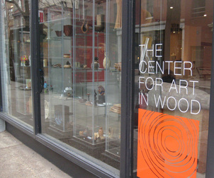
141 N 3rd St Philadelphia
Of Chinese astrology's five elements, wood is associated with harmony and cooperation. Wood is also the heart and soul of the newly reinstalled Center for Art in Wood in Old City, Philadelphia, and harmony and cooperation are on full display. The Center for Art in Wood, which began in 1986 in response to a series of exhibitions and symposia, is recognized as 'one of the most valuable resources for the education, preservation and promotion of the field of art made from wood.' Residencies and outreach programs, an extensive permanent collection, exhibitions, and a research library mark it as the heart of an intriguing traditional and contemporary world.
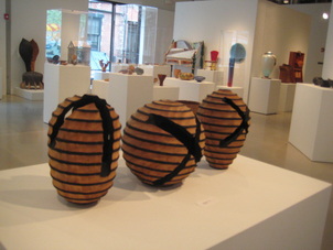
X Series by Todd Hoyer
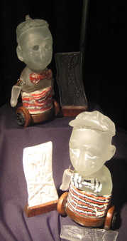
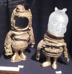
This is not a jolly uncle's good natured whittling; the woodworking here is the absolute pinnacle of art, form, imagination, and craftsmanship. "Turning to Art in Wood: A Creative Journey," the 25th Anniversary exhibition of the permanent collection (on display until April 21, 2012) is a stunning experience, organized to invite the viewer on a meandering path from one breathtaking piece to the next. Make your way through the beautiful airy space, noting how groups of objects focus on a technique, a type of wood, another marvelous idea of how to coax the amazing material of wood into yet another fantastic form and finish.
Cor Blimey by Robin Wood
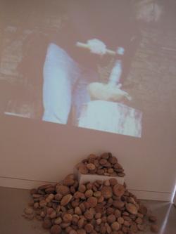
Whatever you think you know about woodworking, you're going to be surprised by how much more there is to be imagined, built, turned, polished, created. Wood in all forms sits on the floor, stands on pedestals and platform, hangs on the walls; one engaging work, a pile of rough, unfinished turned forms clusters against one inner wall under a video showing the artist, Robin Wood, at work. Silent but dynamic, Mr. Wood's presence in the gallery is a quietly compelling reminder of the labor that went into each of these objects, no matter how perfectly pristine in finished form.
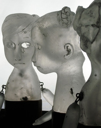
 Untitled Galen Carpenter Pristine is certainly the word for Galen Carpenter's exquisite inlaid vessel made of common chipboard inlaid with exotic rosewood and zircote, a combination that is as successful as unlikely. 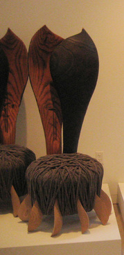 Natural Desire by Jack Larimore Some pieces take a whimsical tack, like Jack Larimore's hefty chairs, titled Natural Desire, which spoof the idea of function into rich substantial sculptures, and Joanne Shima's Child's Chair, reminiscent of Gerrit Reitveld's painted icon and seemingly built of nostalgic TinkerToys. | 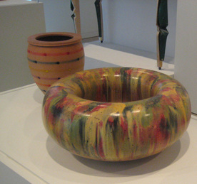 Torus by Hap Sakwa and The Turner's Palett by Robert F. Lyon Color makes a good pairing of Hap Sakwa's highly polished Torus bowl of laquered poplar and maple and Robert F. Lyon's The Turner's Palett #2, a simple form delightful in its construction of basswood and colored pencils. 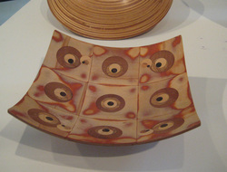 Palo Santo and Maple Swirl by Gianfranco Angelini Gianfranco Angelini's elegant curved plate is one of many examples of unusual woods used for fine woodworking; his is a combination of common maple with Peruvian Palo Santo, a wood that is said to have been used by the Incas for spiritual cleansing. |
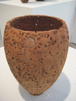
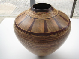
Nagare Vessel by Dale Nish
If I had to pick a favorite - it would be very difficult - I might opt for Dale Nish's Nagare Vessel. The 'wormy ash' wood has a soft velvety tone, and the natural holes and trails contribute to a topography that is a beautifully conceived and finished conversation between artist, material, and the grander idea of nature itself. The result could not be a more perfect reminder of the spirit of harmony and cooperation represented by the woodworker's art.
The Center for Art in Wood is at 141 N 3rd Street Philadelphia 19106
Turning to Art in Wood: A Creative Journey is on display through April 21, 2012
http://www.centerforartinwood.org/
The Center for Art in Wood is at 141 N 3rd Street Philadelphia 19106
Turning to Art in Wood: A Creative Journey is on display through April 21, 2012
http://www.centerforartinwood.org/


 RSS Feed