artsmarttalk.com
Share ArtSmart
  • Home
  • ArtSmartTravel
    • ParisArts&Pleasures >
      • Details: Costs and Activities
    • ParisCathedralsTour >
      • Details: Costs and Activities
    • BurgundyWinesTreasures
    • SpainAndalusiaTour
    • What to expect from an AST tour
    • Travel Art Talks >
      • Paris: Art and History
      • Art and Spirit: The Cathedrals of Europe
      • The Loire: Wine and Chateaux
      • Burgundy: Wine, History, Elegance
      • Bordeaux: Wine, City, Villages
  • MacGregorArt
  • Blog/Contact/About
    • About Marilyn MacGregor
    • Contact Me

LIGHT at Longwood Gardens - Magic in the Dark

9/6/2012

5 Comments

 
Picture
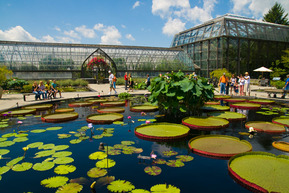
Longwood Gardens - The Water Lily Courtyard
Blame it on a busy couple of weeks, Bill Clinton, a few other things - this post will be enthusiastic but a bit short. The subject is light - specifically LIGHT! - a magical, transcendent transformation of Longwood Gardens, which, by any definition, is already a magical place. Longwood Gardens, located outside Philadelphia in DuPont country near Wilmington, Delaware, is 1077 acres of graceful ancient trees, spectacular flower gardens and fountains, and the most elegant conservatory, chock full of botanical wonders, that you could ever imagine. It’s worth the trip for the water lilies alone!
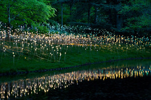
Picture
LIGHT at Small Lake
Longwood has a lively calendar crammed with concerts, performances and education programs. So why add anything? Well, how about for fun, for the sake of pleasure and joy - why not? Light, by British artist/designer Bruce Munro, is the first art installation ever commissioned by Longwood Gardens. It’s also the first solo work by Munro, who does lighting design for gardens spaces and makes smaller, very intriguing works of art.  (See his website link below.)

Picture
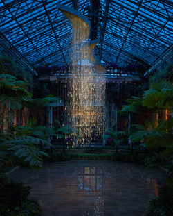
LIGHT in the Conservatory
In order to experience Light you first have to go to Longwood Gardens at night; hours have been extended to be sure it’s dark enough to get the full effect. Right there you’re out of your comfort zone - then, to take it further, you have to follow garden paths, in the dark, out beyond the gentle world of flower beds to where it’s a little rough around the edges. Light, with eight large outdoor works and several inside the Conservatory, is a thrill on a number of levels.

Picture
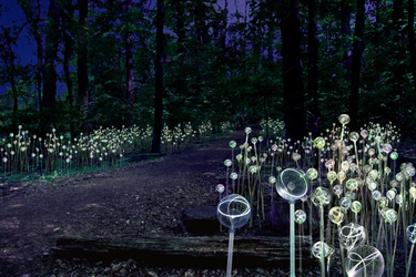
LIGHT - Forest of Light
My top choices: Water Towers, a sort of Space City of towers, glowing pink, purple and orange in a field at the edge of the forest, and Forest of Light, an abundant fairy dusting of light sticks planted around and beyond one of Longwood’s three magical (there’s that word again) treehouses.

Picture
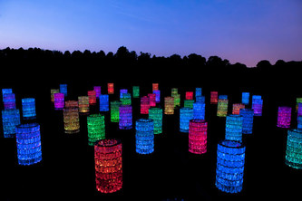
LIGHT - Water Towers
Where does the light in Light come from? Fiber optics–- in creating the ethereal beauty of his installation, Munro has made an important statement about the interface of technology and imagination, redefining art without losing the sensual aesthetic. He’s also a proponent of recycled and renewable materials – Water Towers, for example, is constructed of recycled soda bottles. At night, filled with glowing light, they might as well be diamonds. For details about these and other features of Light, please read my article for the Broad Street Review.
http://www.broadstreetreview.com/index.php/main/article/light_longwood_gardens_first_art_piece1/
Photos thanks to Longwood Gardens (may be enhanced for clarity)
Light will be at Longwood Gardens through September 29.
http://www.brucemunro.co.uk/
http://www.longwoodgardens.org/

5 Comments

LA Story - Fun, Art, and A Big Yawn

8/22/2012

3 Comments

 
Picture
LA Farmers Market Fairfax and 3rd
I was in Los Angeles about a week ago at the end of a trip that started in the Bay Area, took in magical Monterey, and wound down the coast. We chose our LA hotel to be within a short walk of LACMA, the LA County Museum of Art. I know–- walking in LA - what a concept! I recommend the hotel, The Farmer’s Daughter, a cheery, funky-chic update of a 60’s motel with a good little restaurant, and the location, right across the street from LA’s authentic old Farmer’s Market. The Farmer’s Market was a real find, full of great food stands of every possible spot and stripe, teeming with life, fun, and colorful people.

Picture
The Penitent Magdelen 1638 Georges de la Tour
LACMA was a bit dull by comparison, I’m afraid. Granted it was mid-August, a slow time in the museum world, but still...… I took a group of students to LACMA once. We had a grand time and I hold a memory of it as a very exciting place, with a spectacular collection of Pre-Columbian art, a Japanese pavilion that provided a hushed, transcendent experience, and a stimulating collection of European and Classical art. I’ll never forget the boy who, in near tears, came to tell me that he had actually seen George de la Tour’s Magdalen - he’d done a research paper on the painting so he’d met a beloved friend.

Picture
Mayan Vessel Classic Period
It’s been a few years since that trip, well before the recent Renzo Piano renovation that was intended to bring a sense of unity to the various buildings. I could spend this post quibbling, but I’ll just hit a few sore points. I think revisions to the setting for the superb Pre-Columbian treasures do them a disservice – the cases are poorly and unevenly lit, the labels seem aimed at small children or people in wheelchairs (considerate, of course, but hard for the rest of us), the striped wood paneling that flows through the galleries is clunky and awkward.

Picture
The Broad Contemporary Wing seemed much ado about very little - but again, I came at a slow time when they seemed to be between shows. One big gallery was full of big photographs of people standing next to big rocks, part of the Levitated Mass project. I asked, but the guards couldn’t point me to anything else going on in the building, except the elevator by Barbara Kruger with black and red stripes of words - a cute sort idea but a gimmick rather than a real work of art. The entry up a long steep escalator, with a view of clouds in a perfect blue sky, was the best part of the visit.

Picture
Levitated Mass 2012 Michael Heizer
But the biggest, most expensive, most over-hyped yawn was outside in the courtyard. The Rock. Officially known as Levitated Mass, by the artist Michael Heizer, the Rock was brought at enormous expense from a quarry in Riverside County, 60 miles from LA to be installed over a purpose-built concrete trench; it opened to the public on June 24. Much has been made of the trip, the size of the Rock (340 tons) and the significance of the installation, relating it to Stonehenge, mortality, asteroids, etc.

As a rock, it’s impressive, but as an installation, it’s a rock.

Picture
Levitated Mass 2012 Michael Heizer
The ‘levitated’ part doesn’t really work. It sits firmly on supports on either side of the concrete trench; walking under is a pleasant, curious experience, but doesn’t come with a spine-tingling portent of imminent doom from all that solid weight crashing down on your head (I think that was the intent). As I headed up the slope on the far side, the couple behind me expressed much the same as I was thinking, but a little girl in a hat and a light summer dress said it best. Turning to her younger companion as they raced down the trench toward the rock, she stated firmly, ‘Don’t worry. It’s not very scary.”

Picture
Mulholland Drive 1980 David Hockney
If you’re in touch with the universe at all you don’t really need a Big Rock to see eternal themes in nature - you can find them in a pebble at the beach or a chance leaf fallen from a tree. In LA, to top it all off, the de la Tour Magdalen was on loan to another museum. But not all was bleak and disappointing - I got a good look at David Hockney's rich and beautiful Mulholland Drive (The Road to the Studio), as idyllic and gorgeous a view of LA as can be.

Enough of my grumbling - let's hear yours! What are your 'Big Yawns' in art?

photos by the author
Hockney painting courtesy of LACMA website

http://www.lacma.org/
http://www.farmersdaughterhotel.com/
http://www.farmersmarketla.com/

3 Comments

3 Visions of Heaven - Southern California Design

8/13/2012

6 Comments

 
Picture
Barton Myers Toro Canyon House - Kitchen area
Climate and architecture have a great deal to do with each other. If you have snow and long cold winters you pitch your roof at a steep angle and make insulation and heating systems a primary concern. But in Southern California’s idyllic climate you can cross those factors off your list, so what do you do? I’ve seen three answers in the past week, each very different from the others, but all indicating a response to a climate that is the envy of most of the world. None of these three are Mid-Century Modern, the distinctive, forward-looking 20th c. style so associated with Palm Springs, but all are rooted in the history and tradition of Southern California, including the history and tradition of innovation.

Picture
Getty Villa Malibu
In the case of the Getty Villa in Malibu (where I spent a very pleasant afternoon yesterday) innovation takes the form of imitation, one man’s dream of paradise reclaimed from the past.  Spurred by his love of Classical antiquity, with a collection and idea facilitated by great wealth, J. Paul Getty built his ‘folly’ on a cliff overlooking the Pacific around the same time Richard Neutra and others were forging ahead with Mid-Century Modern in Palm Springs.

Picture
Getty Villa Malibu
The Villa first opened to the public in 1974, then reopened in 2006 after a major renovation. It’s an important center for study and education - it’s also a great example of how climate shapes architecture. The climate that shaped the Getty Villa was, of course, that of Ancient Rome, particularly the port cities of Pompeii and Herculaneum, but the combination of sea and season - or lack of seasons - was virtually identical to Southern California. A stroll through the garden is an exercise in the familiar–- the flowering plants that fill California gardens and overflow median strips on the freeways, the eternal bright blue sky reflected in the center pool, the seamless flow between inside and outside that only happens where gloomy skies are a rare and short-lived.

Picture
Barton Myers Toro Canyon Steel House
As different as can be from the Getty Villa, the most striking marriage of climate and design that I experienced this week (or ever) is in Santa Barbara, about 100 miles up the coast from the Getty. My husband and I were lucky to have the opportunity to spend a night with visionary architect Barton Myers and his wife Vicki in their revolutionary, climate-dictated house in Toro Canyon, high above the Pacific. To reach it we climbed up a dusty winding road past groves of eucalyptus, manzanita and citrus, gratefully leaving behind a Friday traffic-choked Rt. 101, to emerge into another world, accented by a shimmering silver construction wide open to soft breezes and broad vistas of sea, sky and mountain.

Picture
Barton Myers Toro Canyon House - Patio to Water Roof
Barton is a leading proponent of steel construction; his book 3 Steel Houses is a convincing testament to the beauty and functionality of the construction. I particularly liked his statement soon after we arrived: “This house is made of old Buicks and Chevrolets” – end of worries about using up finite resources.  Living there for a day and a half was a taste of heaven - we gorged on blood oranges from their trees, drank wine from their grapes - and most amazing of all, swam in their roof. That’s right – swam in the roof! The roofs on Barton Myer’s Toro Canyon Residence are water roofs, which insulate and provide all-important fire protection - most of the roof is a shallow layer but - why not? - one end is a lap pool with a 50-mile view!

Picture
Barton Myers Toro Canyon - Living Room
Picture
Barton Myers Toro Canyon House
Picture
Barton Myers Toro Canyon House (with Jack the Cat)
What Southern California lacks in climate challenges it makes up for in fire danger, especially in the ubiquitous narrow canyons where the Santa Ana winds sweep over the mountains fanning dry hot air into a dry brush-filled landscape. Barton’s steel house is a paragon of fire readiness; not only the water roofs on the residence, his studio above the house, and a smaller guest house below, but features such as extra steel doors that pull down over the glass garage door facades, and a ring of water-laden cacti that extends fire protection into the surrounding land. As in the Roman villa design, with Barton’s steel house outside and inside flow back and forth easily and naturally, one barely distinct from the other - until it matters.

Picture
Santa Barbara Courthouse 1927
Finally, also in Santa Barbara, the great Courthouse makes yet another statement about climate and design. After a terrible earthquake in 1925, Santa Barbara decreed that building needed to be rebuilt in the old Spanish style - the courthouse dates from 1927 but has the timeless look and feel of old California Missions which were sited on the flats without access to mountain air. Thick whitewashed walls, loggias, a tower high enough to collect the breezes - with a 360 degree view - it’s a beautiful, gracious place that stays cool even on the hottest days.

Picture
Santa Barbara Courthouse
Decorations explode inside the building - colorful tiles of endless variety climbing the stairs and gracing the hallways, elaborate painted ceilings topping the stairwells, wrought iron banisters and railings that warm the hands but stay cool in the ever-present shade.  The tiles were produced in Glendale at a time when Southern California was noted for arts and crafts ceramic production - one tile sequence tells the story of Saint Barbara who was, fittingly, imprisoned in a tower. If she’d been in this one she probably wouldn’t have minded.

Picture
Santa Barbara Courthouse
Picture
Santa Barbara Courthouse
Picture
Santa Barbara Courthouse - Assembly Room
One of the glories of the Santa Barbara Courthouse is the Assembly Room, seemingly untouched since Spanish rule, with leather benches and dark wood paneling. A treasure of a mural marches around the walls, painted in 1928 by Dan Sayre Groesbeck, who worked on historical films for Cecil B. DeMille. The mural tells the story of the discovery, exploration and settlement of Southern California - it’s said that you can find Douglas Fairbanks and other old movie stars sharing space with Father Juniper Serra, Spanish soldiers, and California Chumash Indians.

Most photos by Marilyn MacGregor
Some Toro Canyon photos courtesy Barton Myers
Websites for more information


http://www.bartonmyers.com/toro_01.htm

http://www.getty.edu/visit/

http://www.santabarbaracourthouse.org/sbch/

Is one of these your Vision of A California Dream? Leave a comment!

6 Comments

Design Subway Series - Cloud City at the Met, Wendy at PS 1

7/28/2012

3 Comments

 
Picture
The Wendy Project at PS 1
This summer, all summer, New York City is having a Design subway series. The Metropolitan Museum of Art and P.S.1, the contemporary ‘wing’ of MOMA in Long Island City, are both hosting weird playful architect-designed constructions. The Met’s is on the roof, P.S 1’s is in the entry courtyard. Both are audience-friendly with a jungle gym aesthetic; they invite you to clamber up, in, and around - though at the Met you have to have a timed ticket, assure them you’re not drunk, and wear proper shoes. Both present strong visions of human/environment relationships - but only one is  actually doing something about it.

Picture
Cloud City at the Met
Tomas Saraceno’s Cloud City at the Met, a cluster of glass and metal modules strung with cable, is designed to shine, reflect and reveal. Approach it from any direction and you find yourself in it somewhere, alone and with others around you. Because it’s only accessible in good weather you also find in and around it the glories of heaven and mankind - the vast sky, the green carpet of Central Park, and the peaks and valleys of Manhattan's landmark architecture. That should be enough to start you thinking about your place in the man-made and natural universe. Tomas Saraceno, the Argentinean artist/architect who designed it, specializes in modular installations that require physical interaction; he experiments with space and materials, engaging the mind and body in various intriguing ways.

Picture
Cloud City at the Met
Cloud City presents his ideas through planes and surfaces; his installation for the 2009 Venice Biennale, Galaxies Forming along Filaments, like Droplets along the Strands of a Spider's Web, was a 3-dimensional drawing, all lines and spaces. Saraceno’s website offers philosophy as explanation (see link below) - more verbiage than necessary, in my opinion, for what works quite well on an experiential level. I found Cloud City intriguing and engaging, but I haven’t been able to uncover any statement about what Saraceno does with his quantities of metals and materials when the installations are finished. A designer serious about environmental issues should spell out the impact of their work on the environment while they're making an argument for protecting it.

Picture
Inside Wendy
At P.S. I, The Wendy Project is just as serious about the environment but this installation IS actually doing something about it. A bright blue spiky star caged in scaffolding, Wendy is less slick than Cloud City, easier and more fun– and decidedly more pragmatic. The brainchild of architect Matthias Hollwich of HWKN, Wendy won this year’s YAP, MOMA’s contest offering emerging architectural talent the opportunity to design and present innovative projects for a temporary, outdoor installation at MoMA PS1, one that provides shade, seating, and water.

Picture
Wendy at Work - display chart
Wendy does all that and entertains too - water occasionally sprays from one corner across the courtyard, mist rises mysteriously, music comes in fits and start. A touch of carnival draws you into the Wendy world but once there, up the steep stairs on the planks among the poles and fans, you learn what’s really going on. Wendy is cleaning the air. The fabric, so bright and pretty, has been treated with a groundbreaking, inexpensive, undetectable nanotechnology spray that soaks up dirt and particles, purifying the environment even as you clamber around having fun.

Picture
Wendy at PS 1
The effect of Wendy’s presence at P.S. 1 this summer will be the equivalent of removing 260 cars; the concrete walls have also been coated, so P.S 1’s courtyard will be the cleanest coolest place in NYC while it’s there.
The most important thing about Wendy - and it's huge - is that it’s an amazing practical working model - cheap and quick to build, easy to live with, infinitely variable in construction and application for any type of location -– and a no-brainer solution to the relentless, destructive forces of air pollution.

Picture
Architect/designer Matthias Hollwich (center)
Glen Finkel, president of Pureti, the company that makes the spray, reports that the technology is already in wide use in other parts of the world, including Italy and Asia. We’re more than a bit behind over here, but as soon as we start coating walls, roads and buildings, and even wearing fabrics treated with the spray - the uses are infinite - we’ll see a lessening of air pollution and it’s damaging effects. Treasures like the Pantheon and the great Cathedrals of Europe have been greviously harmed by air-borne pollution, not to mention more prosaic infrastructure - this is a remarkably encouraging development. And, when Wendy moves out of P.S. 1, the parts can easily be reassembled and reused in any number of ways.
Author photos
Read more about both projects and the technology behind  Wendy
Cloud City

http://www.metmuseum.org/saraceno
http://www.tomassaraceno.com/MET/Telescope/
Wendy
http://meetwendy.com/
http://hwkn.com/WENDY
http://www.pureti.com/


3 Comments

Painting Rome with Kelly Medford

7/19/2012

11 Comments

 
Picture
Afternoon in the courtyard, Garbatella
Let’s say you’re an artist with a yen for travel. You leave Washington D. C. where you grew up, go to college in Ohio and then in Tennessee, and sign up for a drawing course in Mecca - for artists, of course, that means Florence, Italy. The drawing course ends and you stay - and stay, and after 6 years you move to Rome, where you’ve now been for nearly two years, painting every day. That’s the basic plot for the life of Kelly Medford, a very talented artist and an extraordinary person.

Picture
I haven’t met Kelly in person but I know more about what she does every day than I do any of my friends or neighbors. We first connected through various social network channels and now follow each other’s work on Facebook, Twitter, and email updates. In many ways Kelly is leading a very old-fashioned artist’s life, carrying her oil paints and canvases on a bicycle, scouting out corners and crannies of Rome’s twisting streets to find just the right subject for that day’s work. That's right - a new painting every day.

Picture
Summer Garden Shadows
When she’s done she posts the result on her website and on Facebook - the not-so-old-fashioned aspect of a modern painter’s life. Kelly’s motivation, in addition to her own high-standard search for growth, is an approaching deadline - a show in Rome in October that will feature her paintings and the accompanying stories. With that in mind she is in the midst of a 120 Day painting project - one original work every day leading up to the exhibition. You can have the fun of following Kelly around Rome too - at the end of this interview you’ll find her web addresses.
Here’s Kelly in her own words:

Picture
Saturday on the Terrace, Florence
On getting started in Italy
I had a scholarship to study drawing for a year at the Florence Academy of Art; I spent all of my time in the studio copying 19th century lithographs and drawing 3-5 hours a day from the model. After my scholarship year was up I decided to stay but not to continue at the academy. Instead I took my easel outside and began my adventure in exploring Italy through paint. I got hooked, I can’t stop, it seems that there is always something else to explore, a better way to understand the light and history and people and food of a place. This was 8 years ago now, which is hard to believe, but here I am, still on my painting adventure, as I like to call it.


Picture
The Flower Stand, Piazza Vittorio
Influences and models
...the Macchiaioli because they are the experts on Italian light, Boldini for his bold, fearless brushwork, Francesco LaJacono, a Sicilian landscape painter and a favorite for his bold use of color and the lyricism of his work. I love the mental approach of Cezanné and the quiet perplexity of Morandi. I also travel to the U.S. and paint at least once a year in some paintouts and competitions in order to meet other painters, be pushed to do my best and learn from artists better than myself. Then there is the contradictory element to all of this, which is not spending too much time looking at other painter’s work in order to develop something of my own. I am in search of something that is not only about a personal palette and color choice, but a personal voice. In Rome there aren’t many plein air painters, so I don’t have many contemporaries to compare myself with.


Picture
Morning Market, Pigneto
Effects of living and working in Italy
A strong sense of color has always dominated my work, and I relate and think in blocks of color when painting.  Since being in Rome my work has evolved mainly in three areas:
1)    Color palette/choices
2)    Narration or using paintings to attempt to tell the story of a place
3)    Dialogue and interaction playing a major role in my work
Rome has a quality of light that is intense and extremely warm in nature - either golden or pink/red. I adore it and search to bring it out in my plein air work.


Picture
Morning at the Fountain
120 Day Project – October Exhibition
In October I will exhibit 35 paintings and their accompanying stories, all from the last year and a half since I moved to Rome in late 2010. The city was so overwhelming at first that I began by inventing a project called When In Rome to explore the different neighborhoods by painting them. While I’m painting on the street people stop to see what I’m doing so I take those opportunities to talk to them and to ask them about the place, its history and their personal story of the place. It’s been a great way to get to know the city, its history and inhabitants. It’s also of the utmost importance to me personally to document Rome how it is today.


Picture
View toward Monte Mario, Pincio
When I began thinking about how I could bring my best work to the show I decided on a project of a painting a day for 120 days leading up to the opening. It’s also a way for me to share my thoughts and process on a daily basis, to reflect on the work I’m creating and consider how I can improve it. The interaction, dialogue and feedback of my readers and collectors are invaluable and help me enormously.

Picture
In the images you can see to what good use Kelly has put her years in Italy - her lush, deeply colorful paintings are a testament not only to her skills and her eye but to a second nature feel for the magical warms and cools of Italian life - terra cotta, stucco walls, spilling vines and deep shade. Her humane, personal approach to her work and to her adopted city is an inspiration, whether or not you’re an artist. If you’re going to be in Rome in October be sure to include Kelly’s exhibition on your schedule. And if you’re there at any time, think about taking one of her sketching workshops - what a wonderful way to see Rome!

Kelly’s website, including details of the sketching workshops is at http://kellymedford.com
Her Adventures in Painting daily blog, with pictures and purchase information is at http://kellymedford.blogspot.com/
Read about the happy experience of one student who took a sketching workshop at http://alifeinrome.wordpress.com/2012/06/07/experiencing-rome-through-the-eyes-of-an-artist-me-on-a-sketching-tour/

images courtesy of kellymedford.com

11 Comments

George Bellows at the National Gallery

7/13/2012

3 Comments

 
Picture
42 Kids 1907
George Bellows was once a revolutionary like his fellows in the Eight and the Ashcan School, braving the wrath of a conservative establishment. These days he’s largely relegated to a pre-modernist narrative past, but the retrospective exhibition at the National Gallery in Washington should return some of his glory. Bellows is a superb storyteller, at his best among the rough and tumble world of New York streets of his early work.

Picture
Stag at Sharkey's 1909
His tales tell of poor lives full of love, hope, and despair; his most famous work is the swaggering ‘Stag at Sharkey’s, one of several fierce, bloody fight scenes he conjured out of the grimy go-for-broke arena of a basement men’s club. Bellows is magnificent here; swabbing paint with broad impulsive strokes, as much an athlete of his craft as his fighters are of their murderous sport. He slathers his main characters with light, giving their pasty flesh an aura that lifts them into an ancient class of warriors. They could be Ajax and Hector, heroes in the thick of the Trojan wars. The scene around them, however, is anything but noble; it stinks of human greed and the low pleasures of violence. I was struck repeatedly by Bellows’s links to Daumier, the great 19th century satirist. The faces leering up at the fighters have a demonic charm that is pure Daumier, who amused his audience while sticking sharp barbs into the fat cats of his day. Bellows is not outright political like Daumier was, but he gets his points across when he needs to.

Picture
Excavation at Night 1908
A series of paintings showing the building of Penn Station leaves no doubt about the relationship between the poor buggers doing the hard work and the city that rises up beyond the pit. The work is hard, dirty, and endless – one scene shows dawn breaking as men gather for a long day, another the small fire of someone keeping watch in the dark of night. With his extraordinary technique and instinct for just enough detail, Bellows tells an eternal story – it could be coal mines in Wales, diamond mines in South Africa – any place where the poor and weak do the bidding of the powerful.

Picture
Beach at Coney Island 1908
But luckily for us, and him too, I imagine, he also has a rollicking sense of joy in life that comes across in work like 42 Kids, and Beach at Coney Island. Daumier is once again present in the gleeful, mischievous faces and gestures, and Bruegel’s there too, delighting in the human gaggle of good plain honest fun. Marvels abound – the clustered crowd at the Beach has an organic truth - the figures seem to be made of the sun and sand that surround them - and the skinny little lad launched headfirst into the black waters of the Hudson in 42 Kids is a flick of perfect animated perspective.

Picture
River Rats 1906


Picture
Albrecht Durer: St Michal and the Dragon 1498
One of my favorites in the exhibition is River Rats, a masterful composition of almost Biblical force, a complex story told in a few strokes of bright light and great expanses conveying a sense of forces beyond knowing. The tiny figures and the two little houses surrounded by darkness, bring to mind Durer's Saint Michael and the Dragon, where human life goes on unmindful of danger while good and evil battle it out above the earth.
Picture
Emma and her Children 1923
The exhibition continues on into Bellow’s years in Maine and later, as a journalist and then with his family in Woodstock. He continues to create impressive compositions, and some beautiful work. His portraits are particularly interesting, among them some poignant pictures of street kids. Those of his family are beautiful and clearly meaningful, but he never tops what he did in New York. There was an affinity there, something about the urban grit, the metaphors he put to good use, the crowded ordinary lives, that just doesn’t come across after he moves on. The paintings and lithographs he did based on reports of German atrocities in WWI are meant to be powerful statements but, although they contain the passion and humanity present in the early paintings they ring false in comparison. The buzz of daily rights and wrongs, large and small, was, it seems, his best inspiration for telling a significant human story though his art.

The George Bellows exhibit is at the National Gallery, Washington, until October 8, 2012
http://www.nga.gov/exhibitions/bellowsinfo.shtm


3 Comments

Long May it Wave - The Language of Flags

7/3/2012

0 Comments

 
Picture
Ben Franklin in the Philadelphia parade
The 4th of July - in my historic Philadelphia neighborhood where the 4th of July was invented, just about every house has a flag flying. There will be parades this week all over the country, with lots of flag waving to stir the excitement. Flags send a lot of messages; they're a whole human language system with layers of emotional nuance and significance. They can be symbols of good or evil, partly depending on who is defining the use, and what side you're on.

Picture
Norman Rockwell: Miss Liberty Post Cover 1943
The American flag is beautiful - classic in its design of red, blue and white, and its pattern of stars and stripes - and beautiful for associations with all the good things about this country. Even if Americans don't believe all those things (or worry about them), most love their flag and what it stands for. Of course we're not alone - every country has a flag - many are red, white and blue in some combination and many have stars and stripes of some sort - and most people rally to the symbolism of their national flag. That's the point of those bits of cloth and color.

Picture
Claude Monet: Rue Montorgueil 1878
Flags, a supremely visual language, can help walk us through history, telling us about attitudes and values at different times and places. Leaving out some of the darker possibilities, here are a few artist comments on life over the last hundred years or so, annotated with flags. Monet's flurry of flags  in his Rue Montorgueil: Festival of June 30, 1878 is pure spirit and celebration, painted the year of the grand Exposition Universelle in Paris. The world was either in or watching Paris, the head of the Statue of Liberty was on display prior to moving (with the body) to the U. S., and it was a great time to strengthen French pride and loyalty,  just years after a humiliating military defeat. It looks like July 14th, Bastille Day, but that holiday wasn't declared until 2 years later.

Picture
Maurice Prendergast Piazza St. Marco Venice 1898
Italy is an old hand at flags - the bright beautiful display of banners at the Palio in Siena each year are the legacy of pre-national Italy, when every city state and even families had their own flag to rally around. The tradition likely dates back even further to Roman times, when there were team colors for chariot racing and other aspects of Roman life. The American artist Maurice Prendergast, on vacation in Italy, painted giant green, white and red flags flying in St. Mark's Piazza, Venice; it makes a pretty composition, but it also makes a statement. In 1898 Italy was still going through the growing pains of  a new country and hadn't settled on a final flag. Those here appear to be a variant of Sardinian design - the modern Italian tricolor was only adopted in the 1940's.

Picture
James Ensor Entry of Christ into Brussels 1888
James Ensor includes a number of indeterminate flags in his epic Entry of Christ into Brussels from 1888. Contrary to Prendergast's mildly observed scene, Ensor's work is a cry of protest against the modern crush of inhumanity - he turns the shorthand of a flag-waving parade into a mindless mob. By contrast Norman Rockwell - to some the name itself is shorthand for unquestioning patriotism, though Rockwell is far subtler and more interesting - uses the American flag to rally national pride during the difficult WWII year of 1943, cheering the nation up along the way with his good-natured love of detail and fun.

Picture
Jasper Johns Flag 1950's
Probably no artist, certainly no living artist, is more associated with the flag than Jasper Johns. Post-WWII, freedom safely snatched from the jaws of evil, it was a time when an artist could take license with the sacred national symbol and get away with it - shocking to some, but Johns also made us SEE the flag in a new way, as an object, a design, a work of art. His pencil rendition from the 50's is brave and beautiful, speaking a language all its own.
Happy 4th of July!

0 Comments

Rockwell Kent - Art, Nature and the Common Man

6/27/2012

1 Comment

 
Picture
Godspeed 1931
Rockwell Kent was both a perfect creature of his time and a complete original. His brawny, broad-shouldered, but sleekly elegant Art Deco illustrations are firmly planted in early 20th America, when books and print served as potent messengers of cultural meaning, capable of the sharp sting of reproach as well as the fine pleasure of a literate, well-composed page. He is one of a number of American artists, including some of those I wrote about two posts ago, who give us a clear picture of a very particular time.

Picture
But on the other hand, there is only one Rockwell Kent, the fearless adventurer who stalked the wild places of the earth in sturdy boots, a pen and notebook ever at hand. Perhaps best known for his stellar illustrations for the celebrated Lakeside Press edition of Moby Dick  (1930)


illustration from Moby Dick 1930

Picture
Voyaging - Self Portrait
Kent needed no paltry second-hand references for his churning waves, high seas, and angry nature - he'd been there. The list is long and impressive - Greenland (where he was shipwrecked and lived for some time) Tierra del Fuego, Alaska, Newfoundland, an island off the Maine coast - and the wilds of the Adirondack Mountains, his stateside home for many years.

Picture
Vanity Fair illustration by "Hogarth Jr."
Kent walked another tightrope of sorts in his career and life, moving from 'society illustrations' for Vanity Fair (he signed them Hogarth Jr., a nod to William Hogarth, the sly 18th c. English artist and satirist) and sleek ads for a luxury boat manufacturer, to high-toned book commissions, and finally to crisply critical social commentary that aligned with his deeply-held belief in the rights of the common man.

'Workers of the World, Unite' and 'Wake Up America,' both in a show at the Philadelphia Museum, are good examples of how he could temper his message from urgent to subtle. 'Workers of the World, Unite,' seen here on the cover of a 'red' journal, is a powerful call to action while 'Wake Up America' has more than a little Norman Rockwell folksiness - it takes a few moments to register the message of numbing destructive apathy -  time is running out and the flag is being bent and broken overhead.
Picture
Workers of the World, Unite
Picture
Wake Up, America
Picture
N by E - Rockwell Kent 1930
Kent was a gifted writer too, one who put his experiences and his philosophies into words as well as pictures. Like his art, his books are a slightly dated but earnest, authentic record of a fascinating period of time from a singular perspective. A passage from his book Voyaging spells out his identity: "it the reality of mountains and plains, the sea and the unfathomable heavens, unchangingly forever dominating man, cradling him in that remote hour of his awakening into consciousness, forever smiling, brooding, thundering upon him, that have imposed their nature upon man and made him what he is." 

Picture
Home Port 1931
Along with many other creative intellectuals, Kent put time into the Communist Party in the hopes that it would provide a better answer; inevitably his involvement led to clashes with Joe McCarthy and his committee. It also, however, led to remarkable honors and actions. Kent, the first American artist to show his work in the U.S.S.R., was awarded a Lenin Peace Prize; he donated the money to help women and children in both Vietnams during the Vietnam War years.

Picture
Man at the Mast 1929
Kent's brand of bold outspoken courage in art and life, put to the service of big ideas and a greater good, is a bit thin on the ground these days - it would be nice to see more of it right now in our moment. Rockwell Kent would have no trouble recognizing that help is needed for the poor, the needy and the hardworking common 'man.'

The Philadelphia Museum is currently showing Rockwell Kent - Voyager: An Artist’s Journey in Prints, Drawings, and Illustrated Books. Through July 29, 2012. The show is organized by Kent's longtime friend Carl Zigrosser, the founding curator of the museum's department of prints and drawings. The show includes a range of work, including woodcuts, pen and ink drawings, pencil sketches, lithography (a self-portrait with the stone that made the print is fascinating) and watercolors.


http://www.philamuseum.org/exhibitions/760.html


1 Comment

Maurice Sendak - The Work of A Lifetime

6/21/2012

1 Comment

 
Picture
Maurice Sendak 1928-2012
Childhood was very good to Maurice Sendak - not his own so much, but the childhood he gave to others. His books opened up new worlds for children. Though it was sad to lose him last month, he left a great deal - great in all senses - not a bad way to go at 83. Many of the children that were his first audience are now grey-haired grandparents, but I’ll bet a little boy named Max, dressed in a wolf suit, still lives in their hearts.

Picture
From Where the Wild Things Are 1963
Where the Wild Things Are came out in 1963, the same year Sylvia Plath’s The Bell Jar and Betty Friedan’s The Feminine Mystique were published. As much as the others Where the Wild Things Are caused an uproar – it was a time when the future was challenging an outmoded mindset with a dose of hard reality. Librarians and teachers vilified Sendak’s book, calling it dark and too frightening for children, but the kids knew better, recognizing in the simple story of a child struggling to control his own wild impulses the basic truth that childhood is, in fact, darker and more frightening than adults own up to once they’re past it.

Picture
From The Juniper Tree 1974
Sendak had a gift for taking childhood seriously - I’d call it his greatest strength. Too many well-intentioned kid’s book authors think children and their state of being are ‘cute.’ Sendak never made that mistake. His own well-documented childhood in a family of Holocaust survivors (along with ever-present specters of his family’s victims) gave him a front row seat on dark and frightening, but combined with the ebullient humor and spirit ever present in his work, his was a powerful, compelling vision.

Picture
From the Juniper Tree 1974
What isn’t always mentioned with Maurice Sendak is how steeped he was in the traditions of children’s illustrations. He was an original with a beautifully unique voice, but like all great artists, he had a profound knowledge of and respect for his craft and his predecessors. In The Juniper Tree, a collection of Grimm’s Tales (1974), Sendak went directly to the source with a meticulous technique based on European, especially German, engraving techniques. The Juniper Tree is a tour de force of children’s illustration, very different from the bolder linear drawings in Where the Wild Things Are and In the Night Kitchen, but with Sendak’s signature faces, expressions, and gestures  - deeply thought, a bit troubling, and humorous, all at the same moment.

Picture
John Tenniel Alice's Adventures in Wonderland 1865
The German connection in Sendak’s work has been clearly noted, but there is plenty more from the broad field of fine children’s illustration. Beatrix Potter’s anthropomorphic animals, full of charm but no squishy sentimentality, John Tenniel’s seriously, delightfully kooky world in Alice in Wonderland, Walter Crane’s gorgeous command of line and composition, Edward Lear’s goofy playful illustrated verses – and plenty more, including Fritz Eichenberg, an older contemporary.

Picture
Edward Lear 1804
Picture
Walter Crane 1883
Picture
Beatrix Potter - diary page 1880's
Picture
Fritz Eichenberg Jane Eyre 1943
As a young illustrator Sendak must have been well aware of Eichenberg, who fled Germany ahead of the Nazi’s in the 30’s and built a significant career as a teacher and illustrator in New York. Eichenberg’s dark brooding wood engravings for Jane Eyre and Wuthering Heights are among my most enduring childhood memories - when I encountered the editions as an adult I felt the shock of recognition of a long-lost friend. Sendak and Eichenberg were, in some senses, kindred souls, each a master with an affinity for craft and fine careful work in illustration, divided and united by a common history.

Picture
The Prodigal Son 1967
Picture
Child's Christmas in Wales 1969
Picture
Maurice Sendak In the Night Kitchen 1970
Sendak’s path led him to lighter ground where his sense of play had full rein, not only in books but in theatre and opera design. Spend some time with Where the Wild Things Are and In the Night Kitchen and you’ll see that Sendak was always a set designer – his books unfold with all the drama of a well-made play. He never shortchanged children - he gave them the best, and his best was magnificent. The work of a lifetime, and lifetimes before him, is in every line he drew.

An exhibit of Sendak's work has just opened at the Rosenbach Museum in Philadelphia.
Maurice Sendak: A Legacy continues through May 26, 2013

https://www.rosenbach.org/learn/exhibitions/maurice-sendak-legacy

1 Comment

Grit and Revolution: The Ashcan School

6/14/2012

0 Comments

 
Picture
George Bellows: Stag at Sharkey's 1909
Isn't it funny how so many art movements are named by snarky insults? The 'Impressionists', The 'Fauves', even the Gothic style - these were not terms of endearment but put-downs from critics who clearly thought they knew what was 'art' and what was not. 'The Ashcan School' is another example, this time from early 20th century America.

Picture
Artists and Friends in John Sloan's NY studio 1898
In the context of a time when so much artistic fur was flying in Europe (Cubism, Surrealism, Picasso, Matisse, etc.) the work of the Ashcan School can seem a bit tame and stodgy, but these artists, like their European contemporaries, were revolutionaries, rebelling against conservative American tastes - which were at least, if not more, conservative than traditional tastes in Europe.

Picture
Chicago Art Institute Students: Flyer 1913
In 1913 the famous Armory Show was mounted in New York, bringing the first taste of avant-garde art to the U.S. The Armory Show, an earthquake that shook expectations and assumptions to their foundations, was recognized as a colossal event but one that was shocking, even dangerous. The New York Tribune called it “A Remarkable Affair Despite Some Freakish Absurdities.” It is said that notices were posted warning pregnant women away for fear they would miscarry, and when the show moved to Chicago, Matisse was given a mock trial on charges of 'artistic murder, pictorial arson, artistic rapine, total degeneracy of color, criminal misuse of line,' found guilty, and sentenced to die.

Picture
George Luks: Nighttime Buying and Selling on Allen Street 1905
Organized by American painters eager to bring the excitement of Modern Art closer to home, the Armory show included a healthy number of forward-looking Americans, foremost among them the artists who would come to be known as The Ashcan School. A first American volley against the strict traditions of the National Academy was the 1908 show in New York by The Eight, a group of painters circled around the charismatic teacher/painter Robert Henri. It was their only group showing - the circle then expanded, with one result being the group that came to be known as The Ashcan School.

Picture
George Bellows: Cliff Dwellers 1913
As you might guess by the name, these painters, including Henri, George Bellows, John Sloan, George Luks and Everett Shinn, concerned themselves not with idealized beauty, but with a realistic perspective on the gritty life of New York's poorer neighborhoods and rich colorful streets.

Picture
John Sloan: McSorley's Bar 1912
Many of them had backgrounds as newspaper illustrators so there is an element of reportage in the work of the Ashcan School, along with an acceptance, even celebration of human nature in its most banal and ordinary forms. There's more than a bit of Bruegel in the Ashcan School, coupled with the lush expressive brushwork of Frans Hals and Velasquez - no accident. These painters were sophisticated and knowledgeable and most had spent time traveling and studying in Europe. Notable works include Bellow's mighty Stag at Sharkey's (1909) his marvelously detailed Cliff Dwellers (1913), George Luks's Nighttime Buying and Selling on Allen Street (1905), George Bellow's Washington Square South (1910) and John Sloan's McSorley's Bar (1912.)

Picture
William Glackens: Washington Square South 1910
Picture
John Sloan: Sunday, Women drying their Hair 1912
Picture
Robert Henri: Dutch Girl in White 1907
Robert Henri, for being such an inspiration to these painters of lively genre scenes, is better known for portraits - he's a marvelous painter whose brushwork and handling of paint is simply delicious. He did quite a few portraits of children, especially on his travels. This lovely example is from a stay in Holland in 1907.

The National Gallery in Washington has just opened a show of the work of George Bellows - I hear it's wonderful and can't wait to see it! http://www.nga.gov/exhibitions/bellowsinfo.shtm

The newly re-opened Barnes Collection in Philadelphia includes many works of William Glackens and examples from some of the other Ashcan painters.
http://www.barnesfoundation.org/collections/art-collection/collection-search


0 Comments
<<Previous
Forward>>

    Share ArtSmartTalk

    Follow @MarilynArtsmart

      ArtSmartTalk by email

    Submit
    Picture


    MacGregor-Art.com
    Cards and art gifts with a Fine Sense of Fun
    Also at http://www.etsy.com/shop/MacGregorArt

    ArtSmart Consulting
    BETTER CONTENT for your art site
    http://www.artsmarttalk.com/artcontent.html _

    TRY A FREE SAMPLE!
    Postcard Art History
    Easy, fun way to learn about ART - a great gift! http://www.postcardarthistory.com/

    NetworkedBlogs
    Blog:
    ArtSmartTalk
    Topics:
    Art History, Design, Art
     
    Follow my blog

    Accredited Online Colleges

    Categories

    All
    19th C Art4a3f8ec7db
    20th C59300e1f29
    African Art
    Almutanabbi Streetbb1c3786e2
    American Art
    Ann Hamilton
    Apple
    Apple Computers
    Arabic Poetry
    Architecture
    Art
    Art And Nature
    Art And Technology
    Art As Collective Memory
    Art Auctions
    Art Books
    Art Forgery
    Art Galleries
    Art History
    Art In Gardens
    Art Installation
    Art Installations
    Art Licensing
    Art Of Spain
    Art Prints
    Art Technology
    Baghdad Books
    Barnes Collection
    Biennial
    Book Project
    Books
    Brooklyn Museum
    California Design
    Chelsea Galleries
    Chess
    Color
    Constable
    Contemporary Architecture
    Contemporary Art
    Contemporary Design
    Design
    Detroit Institute Of Arts
    Drawing
    E H Shepard
    El Anatsui
    Etching
    European Art
    Expressionism
    Fabric Design
    Flags
    Folk Art
    French Art
    French History
    French Portraits
    Galleries
    George Bellows
    Goya
    Goya Black Paintings
    Goya Portrait
    Hand-made Books
    Historical Art
    Hokusai
    Ho Tanner
    Illustration
    Installation Art
    Iraq
    Jean Clouet
    Lacma
    Lewis Chessmen
    London
    Los Angeles
    Mac Computers
    Mary Cassatt
    Matisse
    Met Museum
    Metropolitan Museum
    Metropolitan Museum Of Art
    Modern Art
    Modern British Painting
    Moma
    Moma Ps1
    Moons
    Museums
    Napoleon
    National Gallery
    Nature
    New Architecture
    New Art
    New Design
    New Goya Painting
    New York
    New York Art
    Norse Art
    Novels About Art
    Old City Philadelphia
    Online Art Sites
    Outdoor Art
    Outsider Art
    Painting
    Paris
    Pat Steir
    Performance Art
    Philadelphia
    Philadelphia Art
    Philadelphia Museum
    Photography
    Plein Air
    Portraits
    Product Design
    Red
    Religious Art
    Rembrandt
    Rome
    Rothko
    Royal Portraits
    Sarah Sze
    Scottish Art
    Self-portraits
    Significance Of Art
    Sketching
    Southern California
    Soutine
    Spanish Art
    Spanish History
    Steve Jobs
    Technology
    Thanksgiving
    The Importance Of Art
    Turner
    Van Gogh
    Velasquez
    Venice Biennale
    Whitney Museum
    Words And Art
    Young Artists

    Archives

    August 2013
    May 2013
    February 2013
    January 2013
    December 2012
    November 2012
    October 2012
    September 2012
    August 2012
    July 2012
    June 2012
    May 2012
    April 2012
    March 2012
    February 2012
    January 2012
    December 2011
    November 2011
    October 2011
    September 2011
    August 2011
    July 2011

    Full Archives at
    http://artsmarttalk.blogspot.com

    RSS Feed

    BLOG ROLL
    http://www.donartnews.com/
    http://joanmikkelsenphotography.blogspot.com/
    http://newcityart.blogspot.com/
    http://experimentstation.wordpress.com/
    http://www.dailyartfixx.com/
    http://venetianred.net/
    http://blog.art21.org/
    http://ahuskofmeaning.com/
    http://eye-likey.blogspot.com/
    http://underthegables.blogspot.com/
    http://www.imaginarymuseum.net/
    _http://www.midcenturyfolio.com/